Week 1
“Magazines are the most successful media format ever to have existed”. During week 1 we explored the history of print and the beginning of the magazine with Ladies ‘Mercury’ and ‘English – The Review’, we reviewed the evolution of magazine management, audiences and advertising. developing on this knowledge we briefly explored how magazines market to a precise, defined audience. continuing further, we investigated the long life and success of magazines, and how popular they are today, ‘CIC’ expands on the value of the UK magazine market:
- Publishing is estimated to have accounted for 192,000 jobs in the UK creative economy in 2017, almost 10 per cent of UK creative industries employment.
- The Gross Value Added (GVA) for UK publishing in 2016 was estimated to be £11.6bn, which has risen from £10.3bn in 2010.
- The GVA of publishing in 2016 rose by 7.7 per cent year on year, and increased by 12.1 per cent between 2010 and 2016.
- In 2016, publishing exported services worth £2.32bn, up from £1.03bn in 2010. The sector exported goods worth £2.57bn.
Growing against the trend of many other UK businesses over the past decade, the UK publishing market has endured as a whole through digitization and the ever growing interest in niche genres and topics. The overseas market has doubled its value in just 7 years, showing a growing trend for English magazine media overseas. the positive profit for the industry as a whole proves their popularity, but print is losing its grip to a digital revolution, such as the readership figures for the top 3 magazines in the UK show us;
‘National Trust‘ had 2.6m individual readers between 2016 and 2017. This publication is a free handout to members of the National Trust Society, which deals with natural preservation, paying members are rewarded with the magazine, and this is an indication of its ingenious distribution system as it stands at the top of the podium.
Next is ‘Slimming World’ which reports a combined digital and print tally of 645K working in bulk sales, the magazine gets the majority of its distribution from clubs or companies.
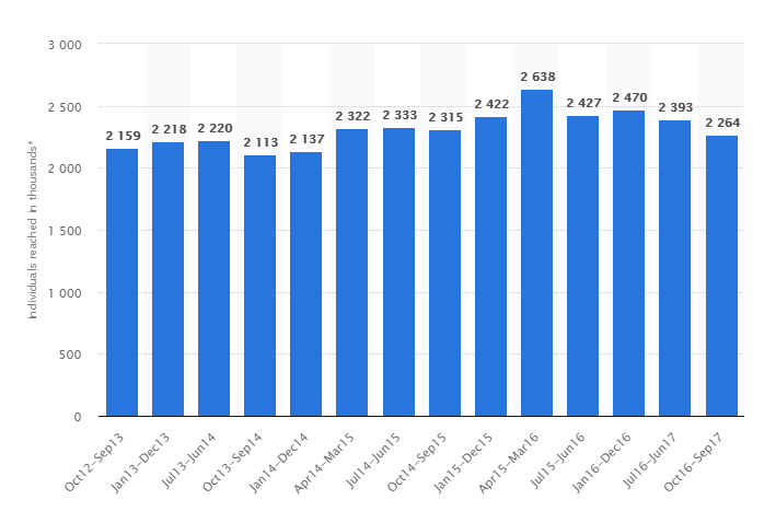
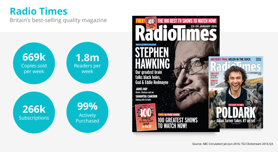
whereas ‘Radio Times’ reports a weekly readership of 669K in print (3.4m reach) with a reach of 4.6m on their digital platforms, which includes an app.
Institutions
The consumer magazine industry is owned in a majority between three conglomerates, they are:
Bauer Media – a German media group;
IPC Time Warner, now Time inc. – an American enterprise;

and Hubert Burda Media– a second German conglomerate with a smaller share of the UK income statistics, but a larger repertoire of different magazines across the globe.
![]()
a consumer magazine is a general or specialist magazine, primarily entertainment. within the Customer Magazine market the industry has its own count as these are usually free forms of advertising, leaflets which are company specific.
Magazine sectors are important in understanding the forms different products take based on their target audience/income model. Here are the defined sectors in the magazine industry:
Consumer
Nicknamed ‘glossies’ these are magazines for the individual, whether it be: a middle aged white male earning over £400K anually; a student on low income, or an Afro Caribbean man interested in football. If the audience is there and they are target-able, there will almost certainly be a magazine aimed towards their interests, which are usually encouraged by your finance, age, gender and ethnicity.
Customer
Customer magazines are less specific at targeting an audience as they are usually just a collection of reviews of products or services usually packed with native advertising. These are afforded the leniency of being less engaging and entertaining, purpose built catalogues mainly published by businesses.
Business to business
similar to customer magazines, these publications run solely on the premise of inter-business relations and as a result market their products to other companies, the articles in these magazine aren’t as glossy or artistic as consumer magazines, but the reader retention usually will be higher and remain as so until the managers and executives that read them change their products.
Niche
Usually a lot more expensive, mostly on a subscription basis. These magazines are for hobbyists or the extremely targeted market, Niche magazines usually always focus on a single theme or element, things such as model building magazines, trainspotters, and other crafts.
Week 2
During week 2 we focused on audience and what a magazine should consider before targeting a specific demographic. tasked with quantifying The Yorkie readership, here is what I can safely assume to be the makeup of a Yorkie reader.
Yorkie target audience:
Age: 18-24
Gender Split %: 50/50, 60/40, non specific gender target although percentages are certain to vary.
ABC1 %: C1(10)/C2(30)/D(20)/E(50)
Working %: 40
Studying %: 60
Local film, music and culture reviews could be included in the production of the magazine, alongside sport, politics and fashion in the York area. These kinds of stories are not only popular with the targeted audience but also cover a wide array of sources and story ideas, meaning the breadth of coverage in this magazine will not be too narrowed.
for my role at this magazine I would be keen to be a culture/film editor as it aligns with my personal interests, for a production role I would have to assume the role of editor/photographer as these are my strong points.
Week 3
During the course of this week we discussed the importance of SWOT analysis in determining what a magazine’s strengths and weaknesses are against the opportunities and threats posed.
a typical SWOT analysis looks like:
LadBible (Digital Magazine)
Strengths
- Distribution: online so is instant to the reader, critical for exposure.
- Popularity: hugely popular on its main platform (Facebook).
- Online interactivity: easier to build reader profiles with instant access to users profiles and constant feedback from live, 24hr interaction with its users.
Weaknesses
- Reader Retention: Longer stories usually have less impact on an audience that tends to spend a low average time on one item
- Reach: only the readership that can afford the technology to view these stories, and mainly only Facebook users.
Opportunities
- Development: the online media landscape is still relatively young with huge potential in growth as technology improves and the availability of media alongside it
- Cost effectiveness: the overall cost of maintaining a small media team alongside an online presence in advertising and website hosting costs is wholly eclipsed by the dying print trade which costs more to produce at a slower rate.
Threats
- Unfamiliar industry: with the online industry’s age comes a challenge, companies must be open to changing their approach, as to keep pace with growing advancements in both technology and public perception.
- Advertising: overly advertising on your platform may come at a price, ever more perceptive audiences may become disheartened or off put by choice of advertising.
The Yorkie
Strengths
- Quality: the overall production time means that longer feature stories and higher quality content can offer readers a more refined experience as to instant media, something people can pay for and physically hold still has a high value.
- Credibility: physical content is usually held in much higher regard for trust than its online counterpart, as a result of the fake news crisis
Weaknesses
- Slow release: as a quarterly magazine the release of this magazine cannot match the popularity and instantaneous availability of online media.
- Niche: for a magazine with a release as slow as this, the target market would usually be a niche one, as a subscription based financial model would be the main route of income. Hitting a niche audience may prove difficult.
Opportunities
-
- Reputation: as a magazine with a longer release, and as a result a more prevalent array of quality stories. The Yorkie may be able to earn a reputation for its content, working tremendously in its favour.
- Online transition: if a print version of the magazine fails to pick up traction, an accompanying online element may help to move the magazine forward.
Threats
-
- The shrinking of print: with the dismantling of the print industry to fewer of the bigger institutions and more of the independent small organisations filling the void, the market has become more targeted, meaning hitting an audience is harder than ever.
- Distribution: with printing costs up, the price afforded to produce the finished product and have it make an impact to its audience, in how it is sold and delivered may prove to be an undoing.
Week 4
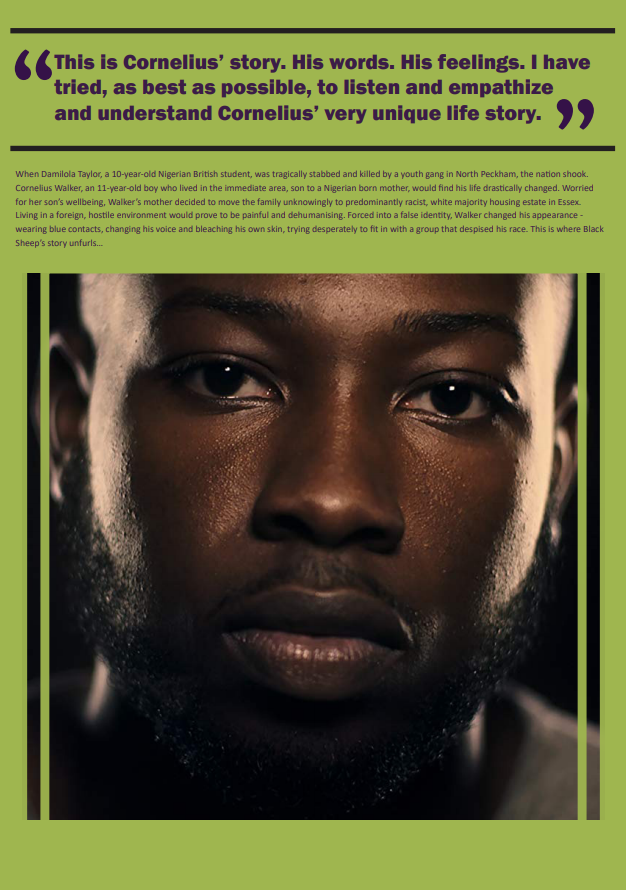
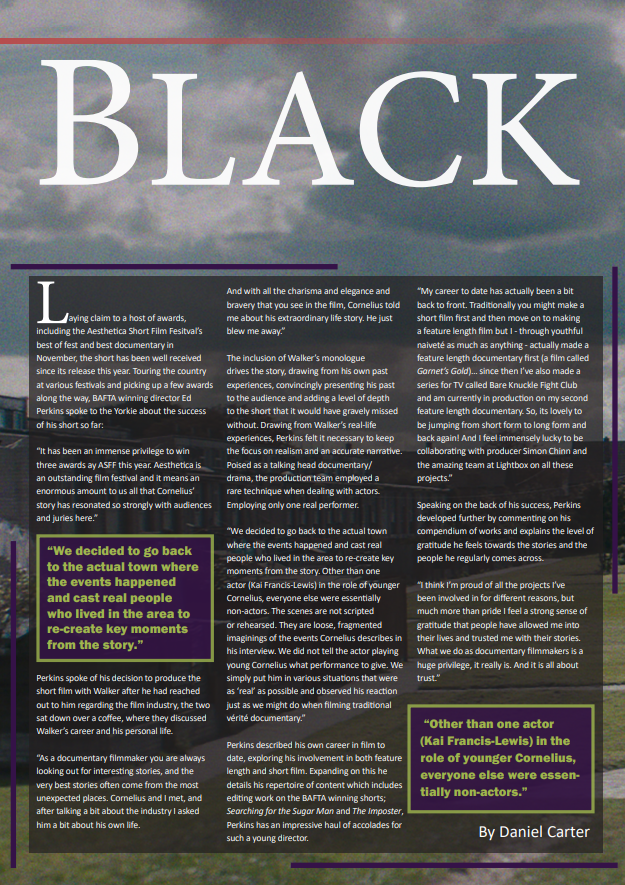
The magazine is progressing with story ideas locked and roles assigned accordingly. I will be writing a story on Aesthetica Short Film Festival hosted in York St. John’s campus and around York city centre. My desk editor is Ava who oversees film an culture at the magazine. I have lined up an email interview with the BAFTA award winning short film director Ed Perkins and have also contacted Cornelius Walker.
The questions I have sent to Ed Perkins are as follows:
Winning not one but two awards at ASFF this year, how would you describe your short film career so far?
Why Did you choose to focus on Damilola Taylor and Cornelius Walker’s stories in Black Sheep?
How did their stories shape your approach to this film, how was the filming style influenced by the narrative?
Filming this as a talking head documentary/drama how did this help you achieve a feeling of authenticity?
Which of your projects would you say you are most proud of, and why?
Would you see yourself moving from Short to Feature length film at any point, and why?
Already established as a multi-award-winning director; what should we expect from Ed Perkins in the near future?
Is there anything else you would like to mention, in regards to yourself or the ASFF?
Week 5
Income and advertising models were the topics of discussion during this weeks session as we looked into the various types of ad strategies used by publishers to better their exposure and income, whilst responding as positively as possible to their audiences.
The areas of advertising that we had covered were:
- Classified marketing
- Native advertising
- External/affiliate links
- Branded media
- Online adverts
- Merchandise
- Subscriptions
- Memberships
- Events
- Display advertising
A few examples of the types of income and advertising I would recommend we employ in our magazine are:
Buy me a coffee (donation model)
This style of income is based solely on our trust in the audience, and as a result of this measures should be taken before using this type of fundraising, some audiences will react negatively to being asked to donate, some may not be able to afford donations and some will simply refuse to donate. This is why the donation model should only be incorporated in an online magazine/print if it accompanies at least one other type of income model.
Native Advertising
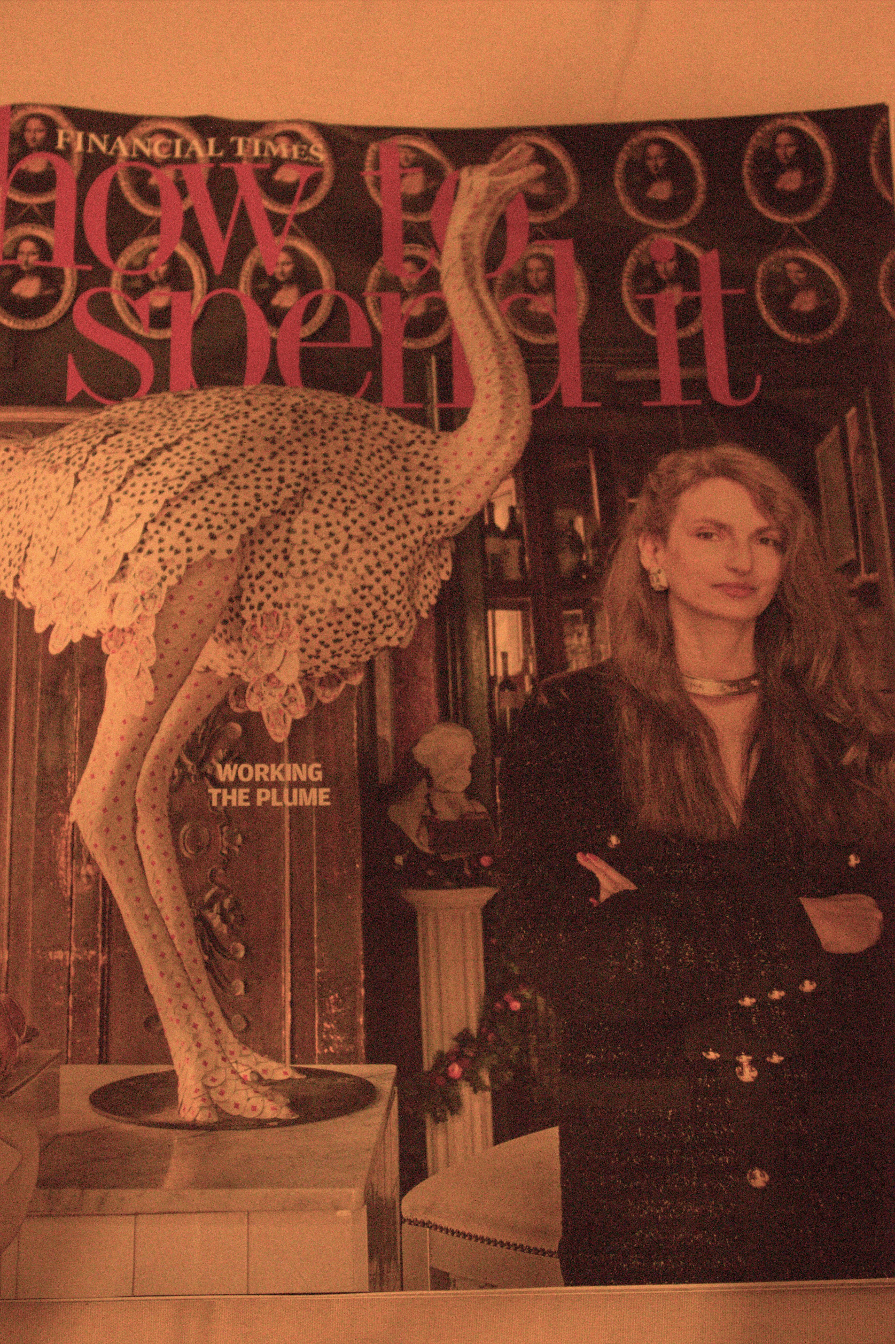
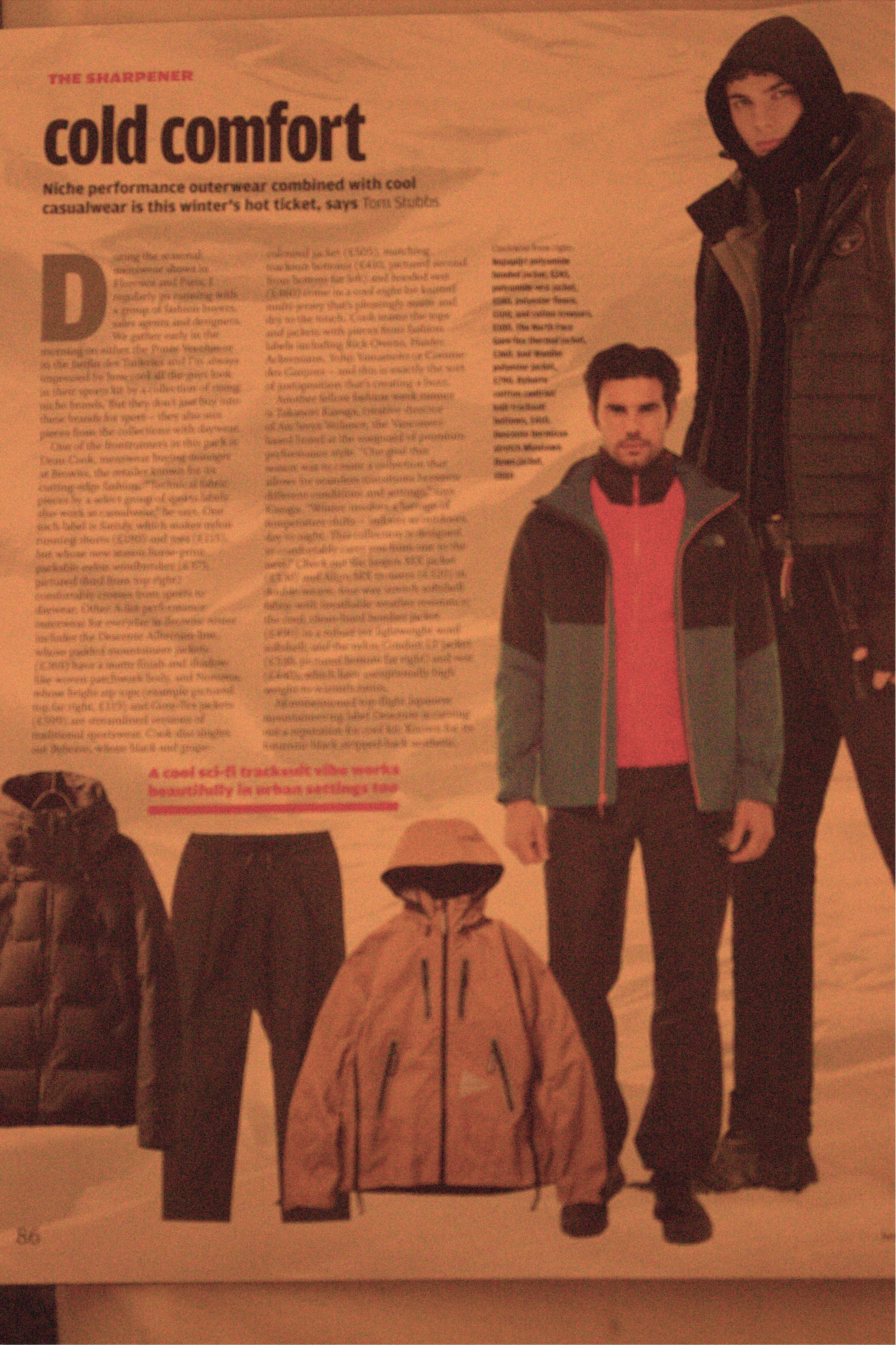
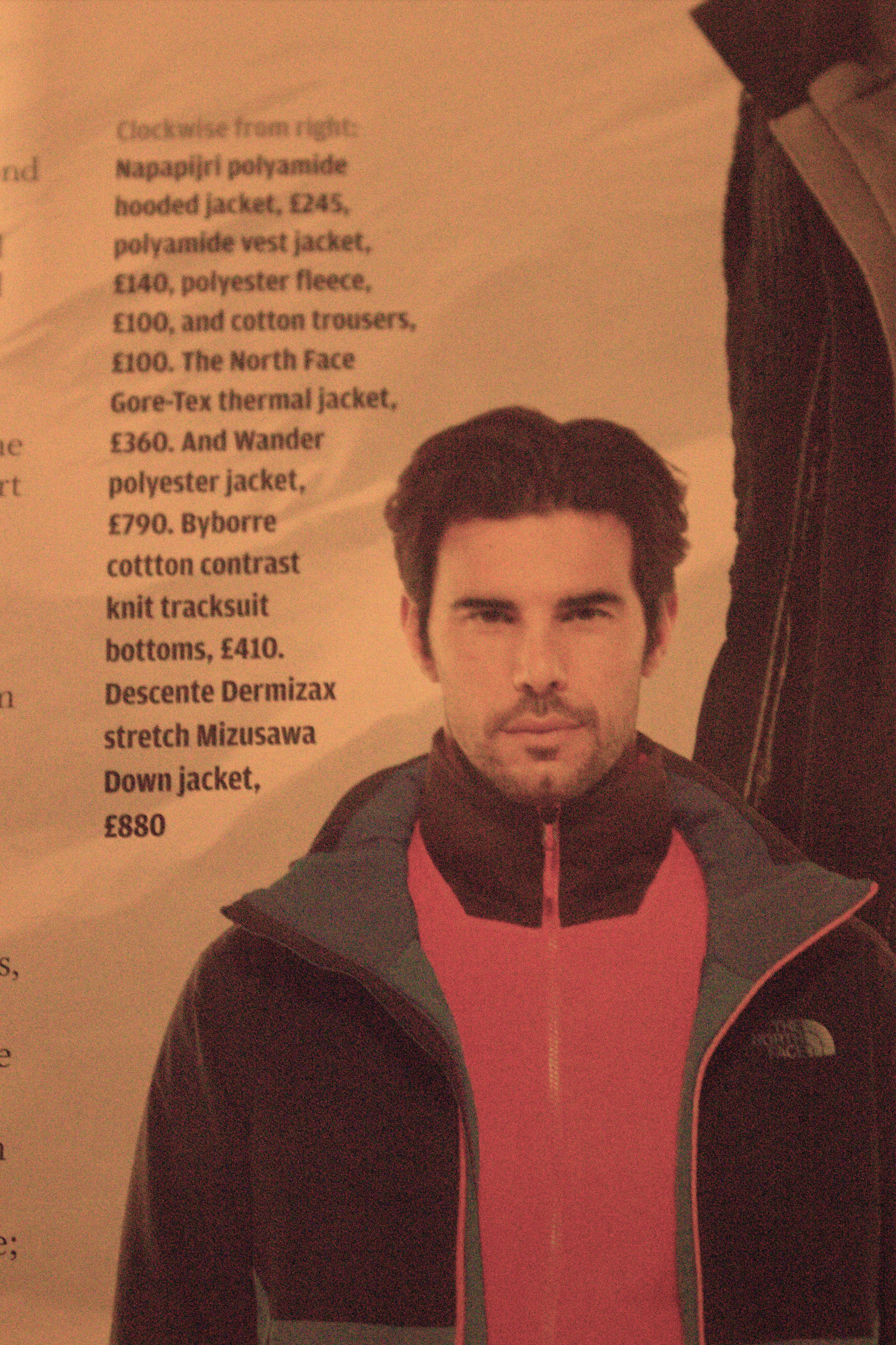
Involving the co-operation with brand sponsors, stories tailored to an audience usually are of a much higher quality than traditional image advertising as, depending on the brand in question, your production costs are usually facilitated in some way, or media can be supplied for you to write alongside. The method is also well suited to mobile and online viewers, should The Yorkie wish to apply this to its website. It is also imperative that The Yorkie refrains from appearing out of touch with its audience, and as a rule should keep the content targeted to its readership. services such as www.buymeacoffee.com offer a donation based income model and allows people to donate as much as they wish, the downside of which is that it is only optional and if the content doesn’t fit our audience, the return would be lower than advertising. An example of advertising that targets its audience well would be the financial times magazine ‘How to spend it’, the magazine is a free pullout included with the FT newspaper, the audience of this particular piece of print are the wealthy elite. Due to the lavish spending of businessmen, how to spend it is a popular read among the upper percentile. The products in here are ideally aimed at their audience, as the read offers advice on trends and what’s popular in the world of high fashion. The inclusion of a North Face sponsored article, advertising jackets priced at £300+ is a good example of the types of high end advertising seen within the short magazine. These kinds of adverts would harm not only the reputation of a magazine if exposed to a different readership, but will also harm the sales and ultimately our level of income.
Subscriptions
The importance of keeping the quality and value for money aspects in mind when choosing a subscription income model is paramount towards the success of of the magazine. If the audience feels the end product is not priced accordingly, this will not only harm the popularity of the magazine but also the overall income if it is littered with ads because the fee is lowered, a good balance is key. If there is a high fee the adverts will have to become more focused and less frequent, as to improve the quality of a highly priced product.
Week 6
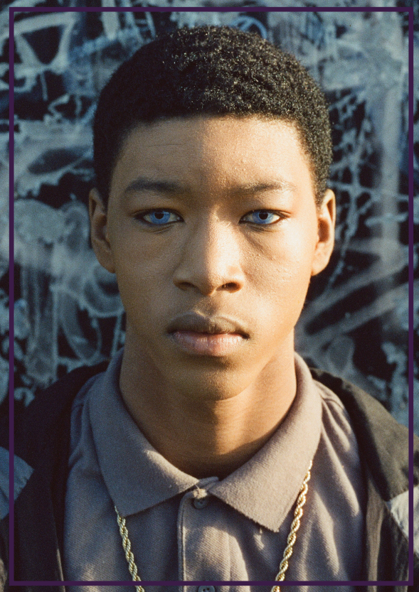
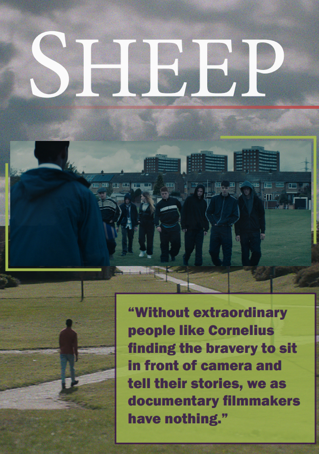
During this week I had taken my colours and their contrast into consideration. I needed to find a style that both worked alongside my images, which I have narrowed down to three after Ed Perkins sent me a collection of production stills and promotional photos.
They are:
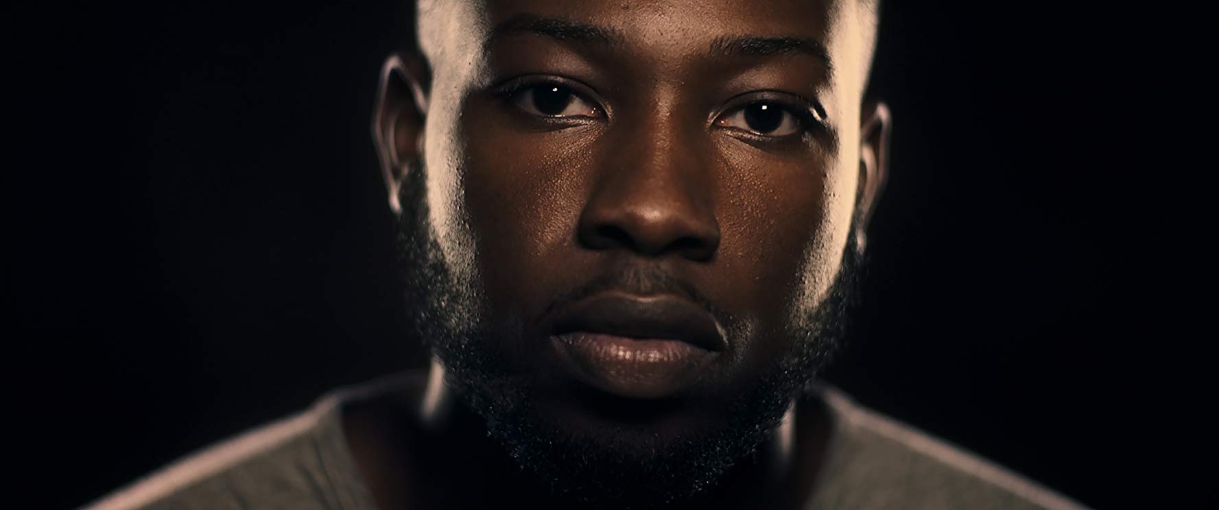
A close up of Cornelius Walker during monologue sequence. For this image I first cropped the black background out and sliced two parallel lines down the side of Cornelius. the rest of the background that remained would contrast well with a brighter, more vibrant colour, I kept this in mind.
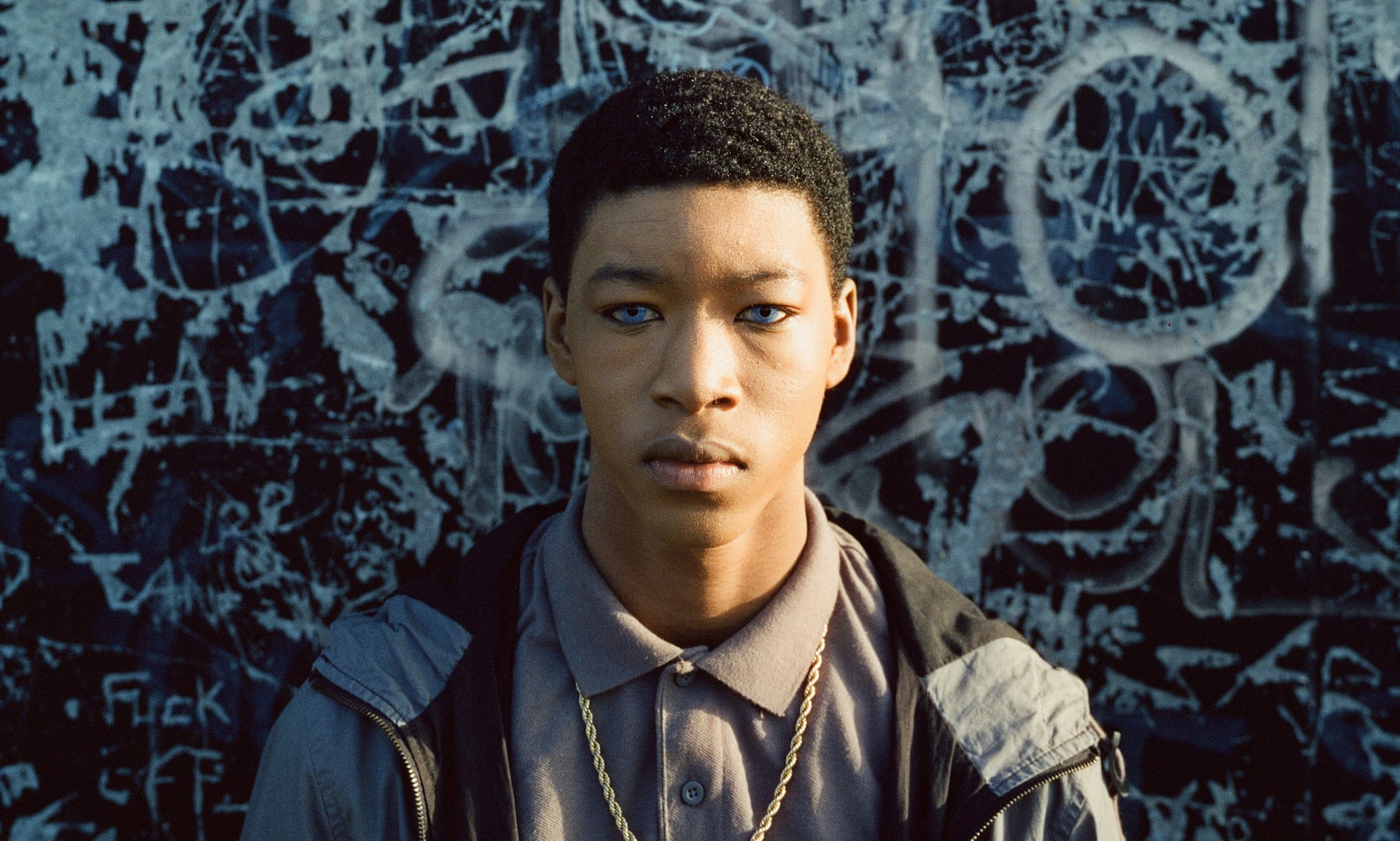
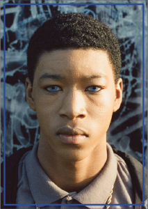
A medium close up of actor Kai-Francis Lewis used in the promotional materials. The framing and composition of this image is ideal for a full page print, however it could not be left bare and I needed to focus attention to young Cornelius’ face. To achieve this I will consider placing a subtle frame around the image, offset an inch from the edges of the page, using a colour that less harshly contrasts with the darkened blue/purple detail in the wall.
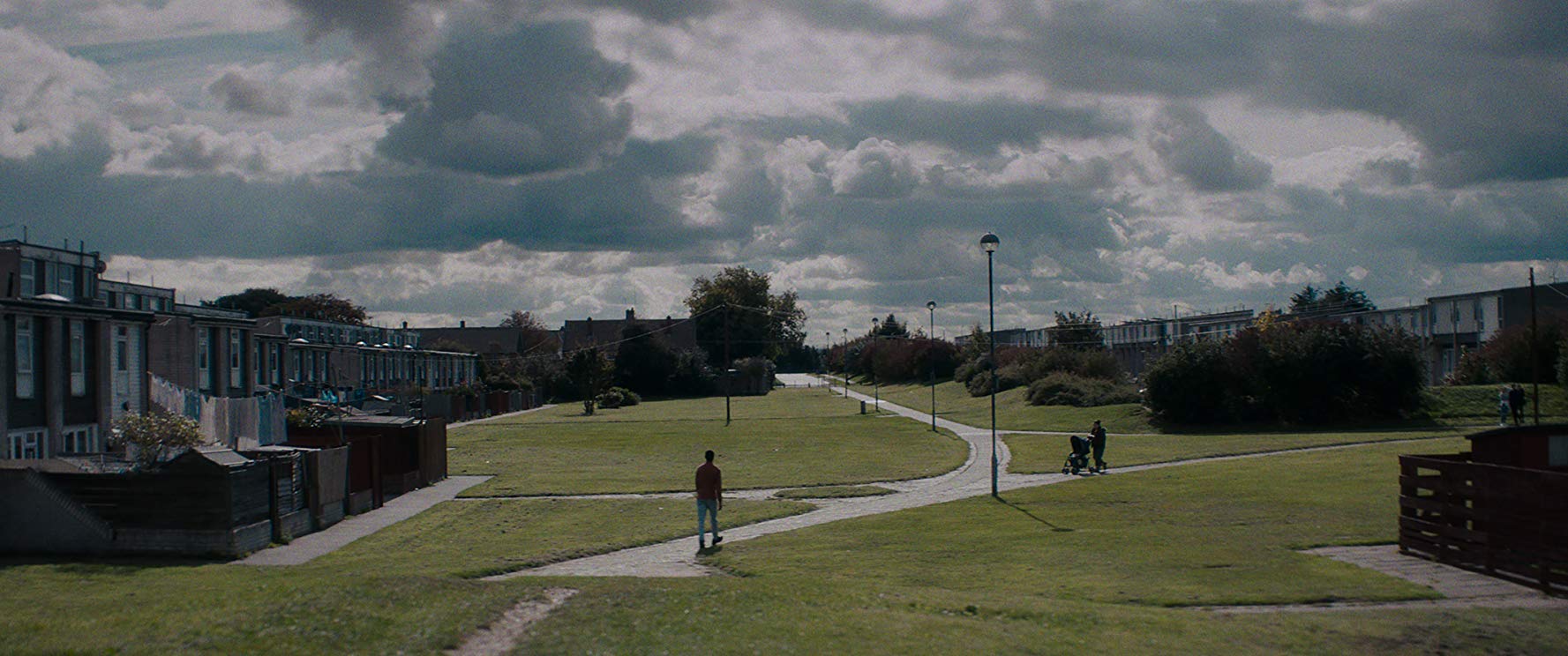
An establishing shot of the estate in Essex that Cornelius had lived on. For this image I will try to incorporate it into my double page spread, the vibrant green of the grass is a good fit against my purple and black elements, meaning that I must find some way of incorporating these colours together along with other possibilities.
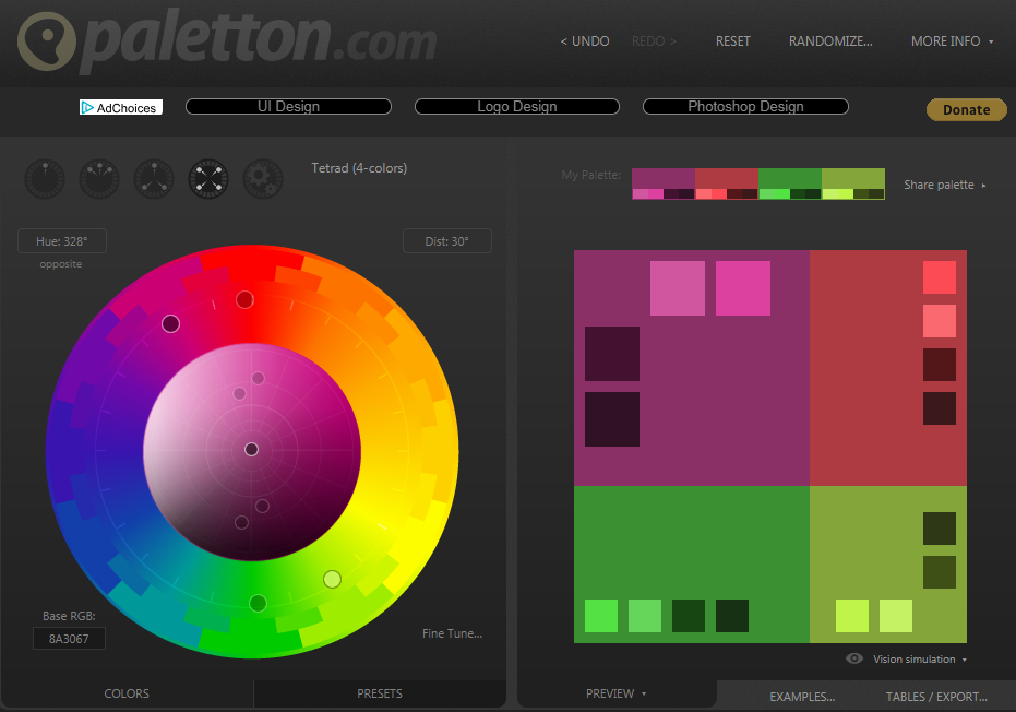
Using an online hexadecimal colour wheel I was able to pin down my base colours and their values for use in InDesign, the fixed points on the colour pickers meant that only the strongest contrasting colours would be selected. By using the dropper tool I took a sample of the grass on my double page spread, from here I tweaked the shade and vibrancy of the these, bringing the green up and the purple down. I had then taken the transparency of both pages down by five percent to allow the text to appear more clearly on the page, soften the colour when it goes to print and to prevent them from overpowering the images.
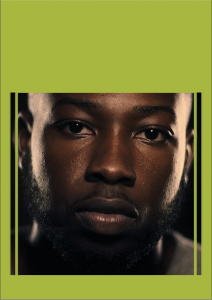
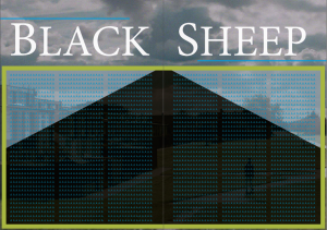
Progressing through my design, I have opted for a full size portrait on the opening page, accompanied with a summary of the short and a pull quote. As the film in question “Black Sheep” has a strong focus on monological narrative which is why all of my images will only contain the protagonist. As a placeholder for my main text i have left a blue box of text to visualise the finished product, other slight tweaks and Considerations include: Font and size of title banner, 4th page banner and 1st page overlay (colour ect).
Week 7
Imagine you had a marketing budget of £100.
if I were to invest £100 into this magazine’s marketing I would develop social media advertisements to promote creative and engaging projects with our potential audience like offering a small cash reward for a one off launch issue cover image that would see interest in the magazine rise as well as giving us an insight into our audience.
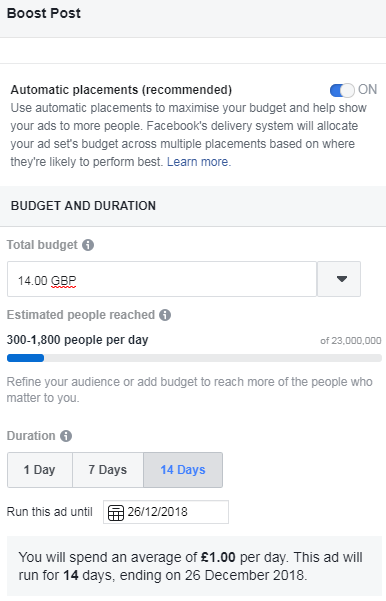
Using FaceBook’s boost post option, which is based roughly on your current following to determine the cost versus volume of unique hits. If, like the example The Yorkie only had a small reach, based on the example being five people and their online contacts, fourteen pound over two weeks would reach 300-1,800 people a day (4,200-25,200 over two weeks) when compared to the size of our team, the reach would be much higher and cost versus hit would lower. One pound a day for this coverage is good value for money for a new magazine and when coupled with the cost of physical advertising is a cost effective way of
boosting your reach.
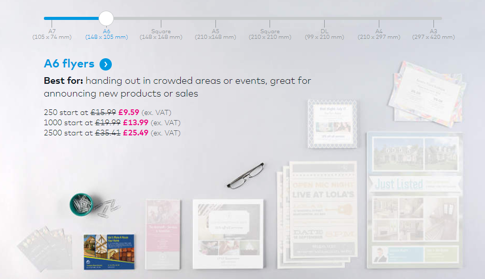
Vista Print offers 1,000 A6 flyers for fourteen pounds on their site, against the digital advertisements the reach would be hindered as the places some of these flyers would be taken may not draw any attention to the material, and as a result would be wasted money. On the other hand the presence of a physical, quality product for our audience to engage with is key when dealing with a print magazine, trust from your audience is just as important as targeting them. Readers spend longer on physical advertising than digital, this is a fact. The quality in effectiveness of advertising to an individual is further ensured with physical adverts, however the cost effective blanket reach of an online campaign cannot be ignored.
for the remainder of our budget a commissioned publicity stunt may work well in our favour, something such as hiring an artist (possibly from York St. John or University of York) to create a giant comical Yorkshire pudding to be placed in the middle of York town centre with a QR code in the centre linking to a preview of our mag, also somewhere to put flyers and draw attention using humour to drive it.
This is why I would spend:
A cash prize for the winning image -£25
Facebook post boost (2 weeks) – £20(£1.40/day)
Other social media posts – Free
Physical Flyers (2,500) normal yorkie ad – £25
Artist – £25
On another consideration, if we weren’t in a position to offer a special one off front cover, I would have half the funds allocated to free issues that can be given alongside newspapers, as a promotional pull out, or with specific items, possibly clothing or like The Economist, in wine crates.
Week 8
From the feedback I had received from my peers, I was able to make adjustments to my design to better encapsulate my feature.
beginning with my design I was advised that the blue text did not fit our house style, white on dark or black on light colours was the recommendation I had received, taking this into account I promptly swapped the colours around. With an absence of pull quotes I was then advised to make room for them, boxes or space left in place for a quote to be dropped in as soon as my source emails my answers. I was also criticised on the vibrancy of the text box’s border and its encroachment into the design as a distraction, I have planned to streamline my design first starting with reducing the body of text to just a singular page, where I can then draw attention to Cornelius by exposing him within the background of the double page spread.
By now I had written all I could, I was a matter of fact checking, gathering other materials, such as awards statistics, personal career ect. Alongside a plan of action for how I was going to lay out the responses from Perkins, by starting with the origin of his idea, his non-traditional filming process, and finally his pride in success.
Weeks 9 – 12
Developing my story further, I had been restricted by my source’s untimely response, however assurances were made that I would receive a reply before my deadline were made clear. This was a result of an email chain between Perkins and myself that consisted of fourteen emails by the time my feature was completed. Finally replying to my correspondence on the morning of the deadline I had my work cut out for me, thankfully I had already spent enough time considering my approach to the design of the feature that I was in a position where writing up the body of the article would be my only task. This ‘mise en place’ approach to my work meant that everything I could have prepared for, was prepared for. I had even promised Perkins copy on my piece as a means of speeding up his reply, this had obviously stretched me further for time on the day of print, however it did mean I had my reply ready and had left the piece hanging on my ability to turn a story around quickly.
I chose to include one of the many powerful quotes that Perkins had supplied me with as the basis of an introduction into the story. Leaving an instant mark with all of the seriousness and direction a pull quote needs to give way to such a powerful narrative. Perkins had given me some guidance to facts that were inaccurate or misrepresented, these were due to an apparent abundance of fake figures and facts from other articles and sources, a 10 minute phone call on the day would help me to iron out these creases. Considerations such as inaccurately naming Perkins as a BAFTA winner when he is more appropriately BAFTA recognised. And the Nigerian link between Cornelius and Damilola, which was quickly rectified after a short conversation.
For my final design I made the following changes;
Reduced text box size by half, exposing Cornelius on the page
Added an additional still from the film with a more subtle, and simplistic frame around, alongside framing my text box with a purple staggered frame
Added my pull quote boxes, all true to the same colour scheme I previously used
Changed the colour of the accent lines from blue to red with a gradient to alpha apllied.
Replaced all images with 300dpi versions supplied by Perkins via the website “WeTransfer”.
During our final session my piece was sub-edited four times, this is to ensure no mistakes are missed, things such as hyphenation and single words a the end of paragraphs were a priority before going to print. Alongside this, text needed to be formatted to the house style, which was Calibri regular 9pt. Important in keeping the flow of the magazine as a whole, it is essential that the body text is entirely the same (in terms of size and font).
Evaluation
During the opening weeks of this production module, we investigated what makes a publication stand out and what drives their success, learning from these historical and contemporary examples we were able to pin down an idea that we were both interested in and an audience we were aiming towards. We made the decision to market this magazine towards a larger age group, young adults through to late twenties with a fifty percent gender split. This was to ensure everyone could both write the stories they wanted to, whilst simultaneously marketing them at a more general demographic that would result in a simpler distribution system.
Developing my ideas further I had wanted to cover a story based around the Aesthetica Short Film Festival hosted on campus. After watching ‘Black Sheep’ I had found the story I wanted to cover, alongside its success at the festival the treatment of the story became much simpler, as film is all about narrative. Building on this I wanted to create a movie poster feel, without making a film poster, my feature title style is inspired by the old black and white film titles.
My inclusion of the font style that shadows one like this is a touch I though necessary to add some depth to my feature and make it more engaging.
In relation to my written content I had received in an untimely manner, there wasn’t a lot I could have done in terms of written work before the day of print. I had reached out to other crew members from this production to prepare myself for a possible no show in response to my email correspondence . Knowing that the director Perkins was aware and ready to answer my questions, I only had to reach out to him a few times until he had responded to me.
Overall the development of my article from notes in a handbook to a fully printed feature crafted in InDesign was difficult in phases just as it was simpler in phases, the time scale on this type of release (quarterly) was ideal for a creative project like this one, a well thought out, good quality feature.