Design Review
Layout:
When deciding on what our magazine would look like during week 3, it was decided that the magazine should look minimalist, clean and modern. I personally decided I wanted my layout to be basic but impacting, with powerful photographs and bold titles, which meant I would have a lot of space on my page.
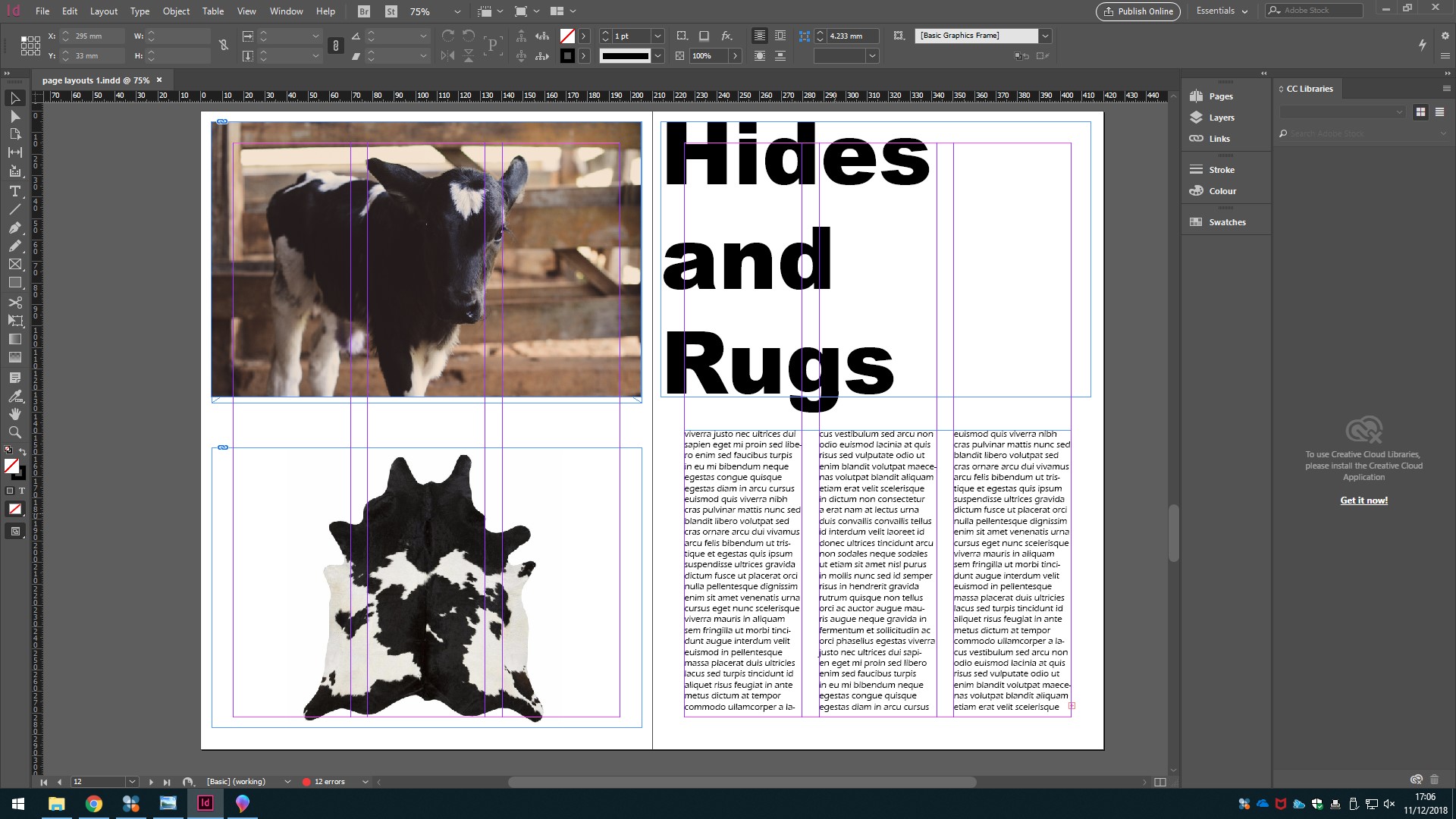
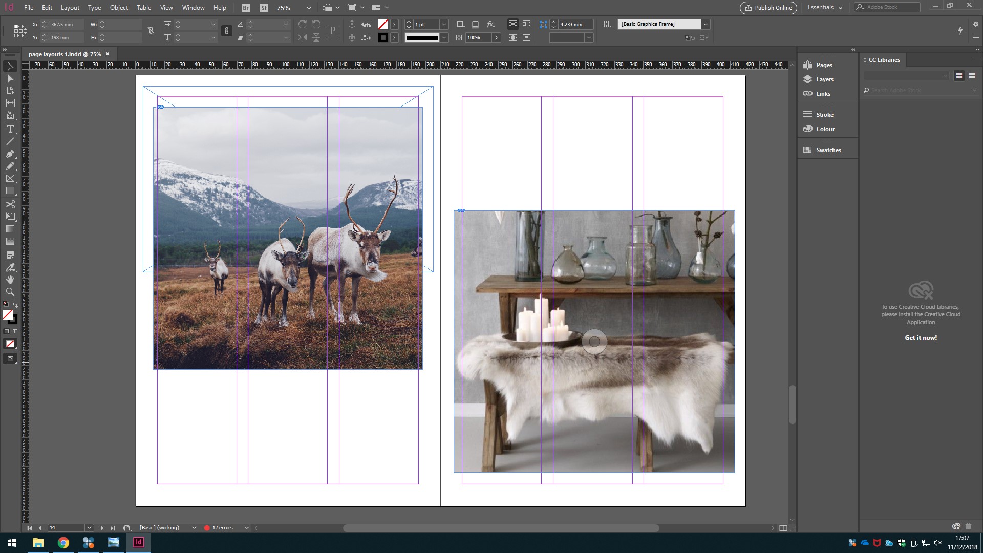
In order to stick with the group decisions made about the magazine, I decided I would have pages that were purely images, and create some space on these pages. By doing this, I ensured my pages looked minimalist and clean but also that my pages were bold and intriguing.
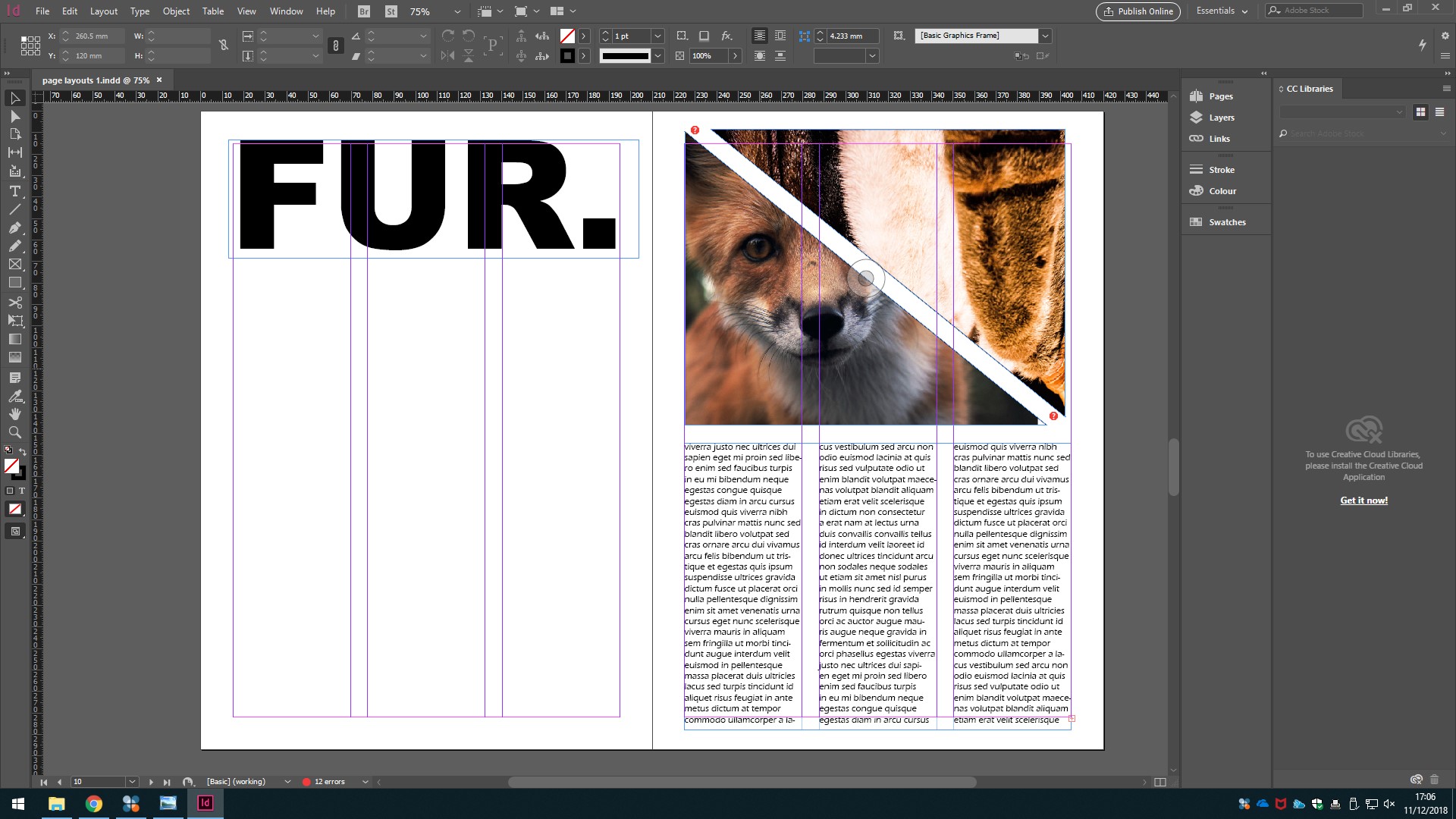
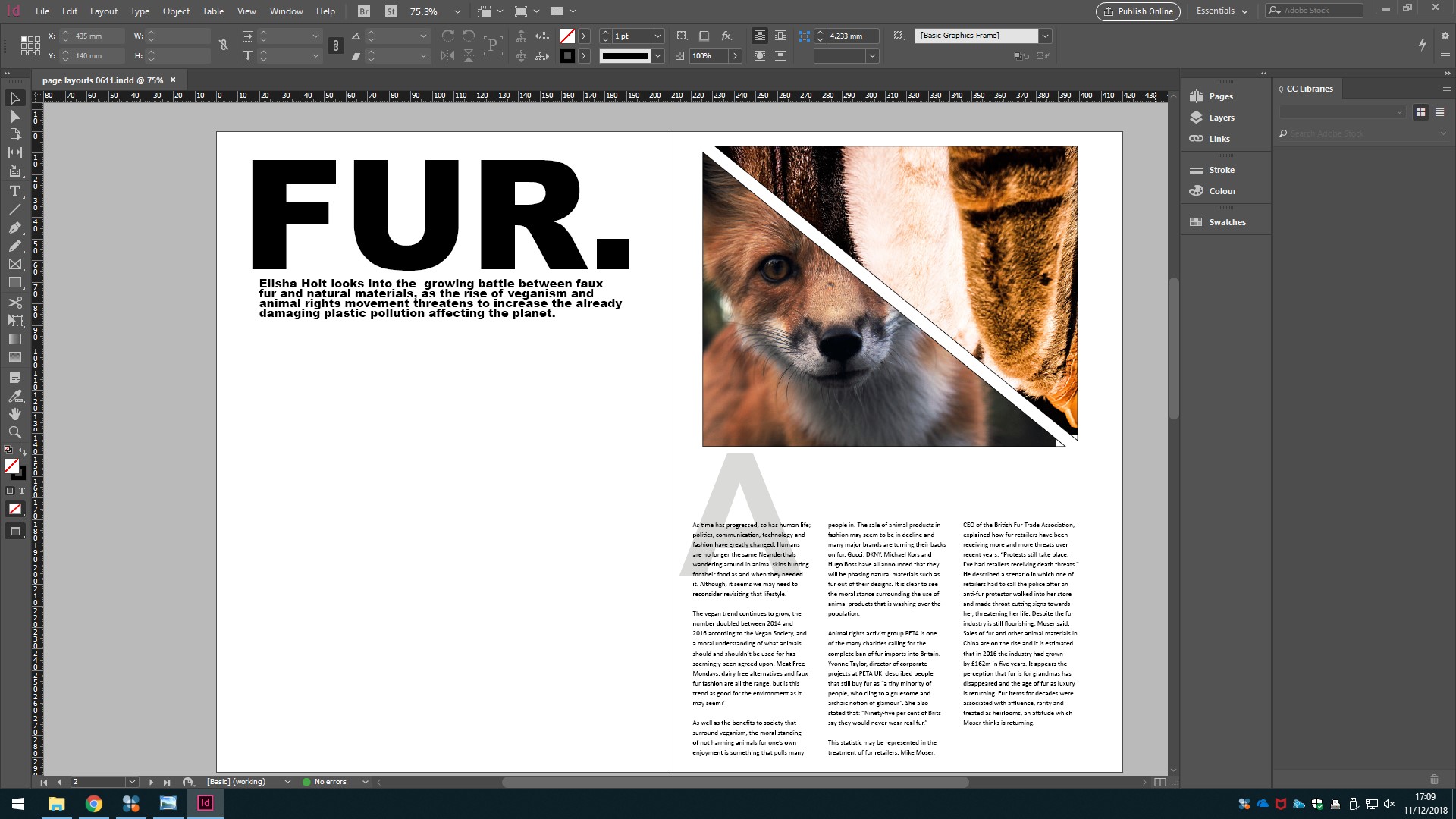
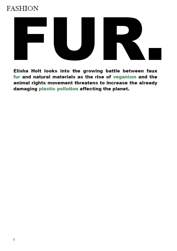
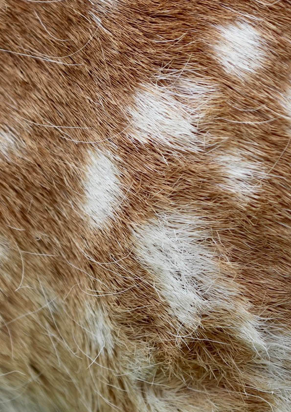
The decision to just title my article “fur” in big bold text was to make it stand out, which is why I put it on a page with only the stand first. The topic of the article really dictated this form as it is such a controversial topic and the angle may not be a way that people have looked at the industry previously.
Process and progression:
This is the first design layout I created when I decided which story I would be doing and before it changed slightly. The design was very similar to the one I submitted and really set the base for what my pages would eventually look like. I really liked the bold title and striking images on the first page and that therefore changed very little, the main reasons for the other changes was the slight subject change of my story. I enjoyed creating these pages and feel I really learnt a lot in doing it, it was the first time I properly played around and experimented with InDesign and discovered what I would be able to produce in this module.
The main thing that impacted these changes, besides the subject switch, was putting my copy into the layout I had made. I initially panicked after putting my article into the layout because I thought it didn’t properly fit and felt my pages looked much too empty, despite being told by Craig that the emptier it looks the better. Because of this, I decided to have two less pages in my spread as I felt I didn’t want it to be more image based, especially when I hadn’t taken the pictures myself.
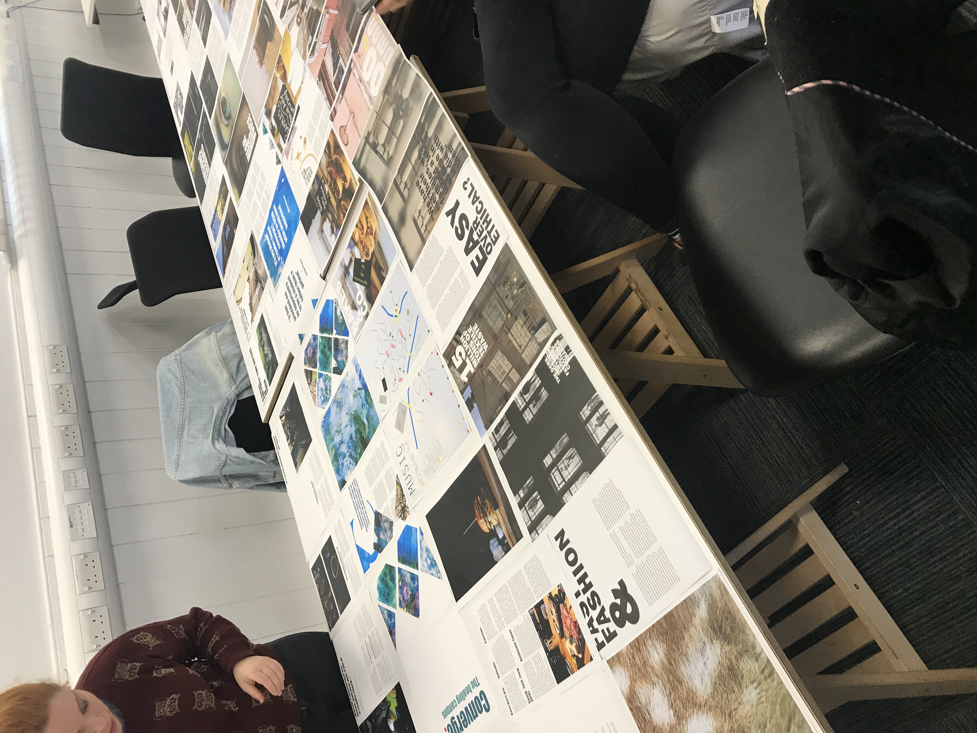
This particular section of the design was what worried me the most, I felt my article looked too sparse and didn’t match with what other people were producing, it wasn’t as busy or as colourful and I was very worried my article would not look good next to everyone else. However, after printing them out and laying them next to each other I felt much more comfortable and happy with my design and this gave me a lot of confidence when it came to InDesign and designing in general, which meant I felt more confident and helped on other design elements such as the front cover.
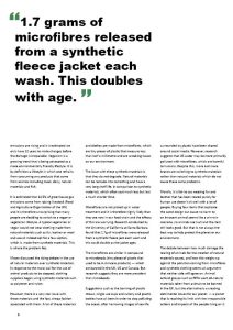
The final stage in the design process was ensuring everything looked professional and polished. I added the coloured words into the stand-first to make it stand out more, the words changed are the most important and kind of summarise what the story is about. The colour had already been used for the quotation marks and I felt it represented my article and the ethos behind it really well.
The most important and time consuming part of this stage was fixing the copy so that the columns were equal width and there were no “orphans or widows” (words or sentences on their own in the line.) For me this was the most tedious and stressful part of the designing, my copy just would not fit properly like I wanted it to and I therefore had to edit bits and add to my copy in order to fix it properly. I feel, however, this is the area where I learnt the most as it really challenged my attention to detail and InDesign knowledge and eventually my layout looked much better after correcting those bits.
Pictures:
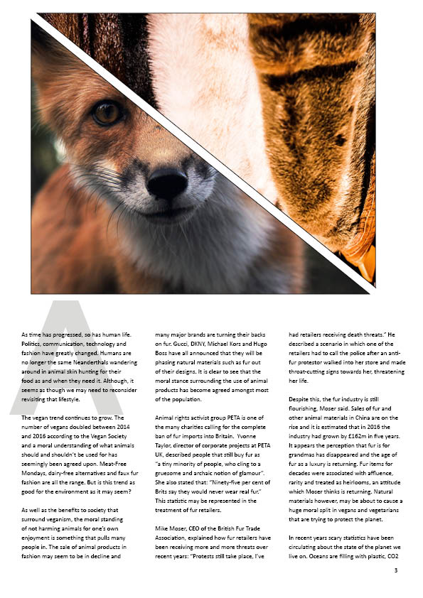
Because of the nature of my article, I found it difficult to find my own images. I am by no means any form of animal photographer and am a little scared of foxes so was not able to take my own photographs for that. I wanted to use an image of a fox because I think that is the animal most people would associate with fur as fashion as it is often the imagery used when fur and hunting are discussed. Therefore, I wanted to make that theme recognisable with my article.
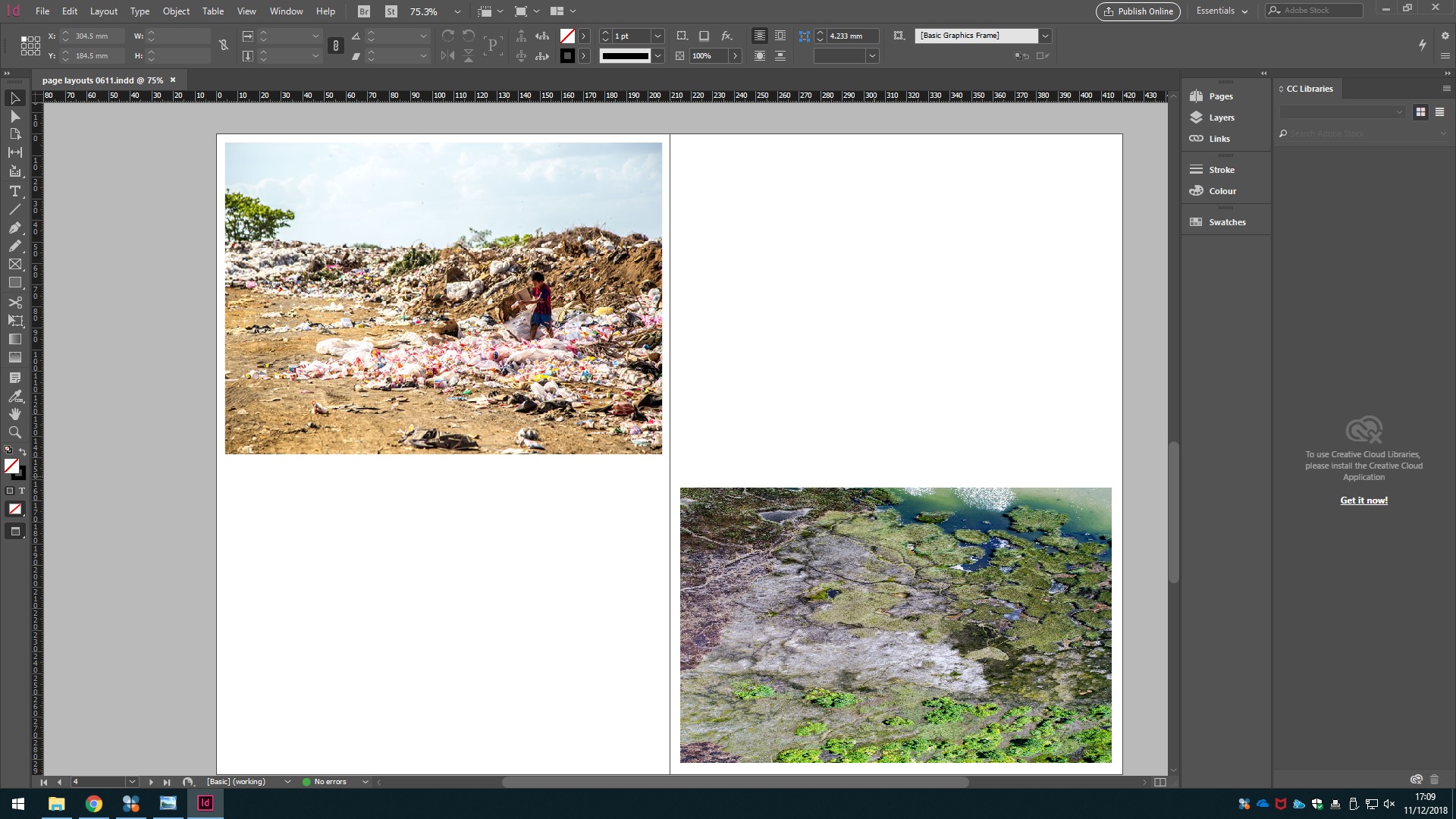
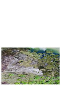
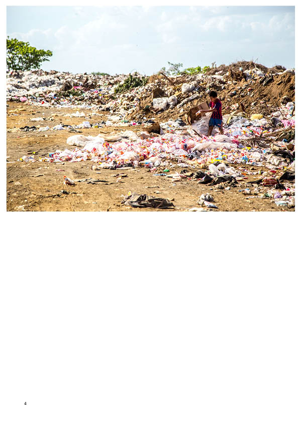
Discussing micro-plastics and the environment was also an issue for using my own photography, as I wanted images showing picturesque landscapes demonstrating the beauty of the environment and the planet to contrast with pictures of dirty landscapes polluted and destroyed by people.
Thankfully, I was able to find good quality, powerful images like these of Unsplash which I decided to use for my design, which meant I was able to focus more on my content and get a design together much earlier than if I had gone out and taken my own photographs.