
Production design and cinematography portfolio
In this blog post I will evaluate my production process throughout this module whilst drawing on further reading and concepts relating to the areas of production design and cinematography and how they have impacted my work where relevant.
Task 1

For this task I produced a powerpoint presentation on a bedroom design for a character set in in any year pre 2000. I began by building my character as production design is usually based around the narrative and director’s vision for instance in Minority Report (2002) the underlying theme according to Production designer Alex Mcdowell (2013) is ‘ water and the idea is that narrative is a series of ripples ‘ there for he uses lots of cool blue tones and transparency.

My character is living in the 1980’s, is part of the gothic subculture, an art student, working class, living in a major city with friends, attends music shows and art shows that reflect their interest. A criticism for myself would be the broad use of the 1980’s as films are usually set in a much more specific time and place as it meant items in my set for example band posters where all released in different years so if it was to be used for an actual film some of these might have to be switched out to accurate ones for that specific year/ years previous. Historical research is the backbone of production design things have to be historically accurate as well as accurate for that characters circumstances for example my character has 1970’s dark wooden furniture as they are recently moved out and probably took hand me downs as a student who could not yet afford to furnish their home. However the furniture I picked also reflects her aesthetic as its quite ornate as older furniture often is which reflects the characters visual taste. Subculture parallels production design in some ways as they both can have a range of musical, artistic and historical influences that are visually reflected so I thought picking a character who was part of a subculture would be interesting for this. For example the set of Fight Club paper street house was influenced by Alex Mcdowell (2017) living in the punk squats in London both reflecting their own generational struggles. Some specific to the 1980’s gothic props I included was grease paint. Which was used by many punks and goths in the 1980’s as colourful eyeshadow, heavy duty black eyeshadow and white foundation where not available or as accessible they are now. Grease paint also is heavy duty so could survive being worn to shows etc. Grease paint also came in large quantities and could be used for different areas of the face. The gothic subculture mainly used the white for the face and the black for intricate eyeshadows.
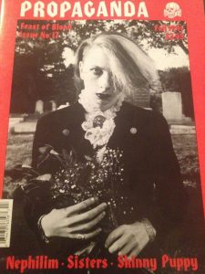
Attention like this can really enhance the realism of a character or narrative if that’s what the story calls for. My main research involved looking through copies of Propaganda Magazine which was a popular gothic and punk magazine in the 1980’s and is no longer published. As my character is artistic and interested in the gothic subculture I thought this might be something that reflects her interests.


A finial critique for myself in this area would have be that I focused very heavily on the subculture aspects and less on the socio/political aspects I did try to keep their technology limited and bedroom small with a focus on DIY to reflect my characters lack of affluence but felt I could have done this better with a bedroom floor plan or house blue print perhaps. I did do some research into young people’s bedrooms at the time however mainly through films released in the 1980’s based around young people such as films by John Hughes but still feel there could have been more historical accuracy in that area.
Task 2
For this task we had to film in a location scare of humans incorporating location scouting and cinematography skills. ‘The location manager is part of the art department, as far as I’m concerned’ (Alex Mcdowell, 2013). There’s a lot of crossover between production design and location scouting and sometimes found locations and set building go hand in hand for example The Grand Budapest Hotel (2014) used multiple sets inside of a found location for the hotel at different periods in time (Legcace, 2013).
‘ All of these compositional decisions convey a very specific idea regarding how Natalie feels at that moment’ (Gustavo Mercado, 2013, p.14). Usually with location scouting you already know what kind of world you’re building through collaboration with the director and have to keep the script, characters and key themes to in mind. I was inspired by the junkyard in the video game life is strange which is the story I was chose to base my location shooting around. Life is strange (2015) is set in a small town where local misfit teen and protagonist Chloe Price lives , the junkyard is where she goes to blow off steam. The game is filled with really beautiful earth tones, Naturalistic lighting and realistic decaying locations which I kept in mind while filming.


I chose an abandoned train yard that had public access and allowed for filming and photography by the public. Accessibility of location is hugely important as I was just one person this was a little easier than perhaps if I was working with a larger crew. I tried to incorporate cinematography techniques with my shots keeping in mind composition and an overall tone which was easier with a story in mind. I did this by filming at golden hour ( the hour before sunset) to bring out a lot of the warm rusty tones of the abandoned trains, colour correction to create a look for the film and the use of music to create a overall atmosphere. I feel that I could have spent more time with the camera before filming as the gain was too high on some of my shots and I could have made better lens choices however the shooting process did allow me to learn how to use the camera even if it was through trial and error. Another thing would be less shaky camera shots, although I was going for a hand held feel I think some of my shots were shaky to the point where it distorted visibility unintentionally. As well as this I had some issues deciding which shots were and were not appropriate which is a vital part of the editing process. Overall I learnt that my technical skills are something that needs overall improvement in future tasks. However I do think that the overall tone and atmosphere of my location task is coherent which is positive.
Task 3
For this task we had to create a character introduction sequence and incorporate relevant cinematography, lighting, camera movement skills. ‘There are any number of contributory factors that can be blended together in order to make an entrance truly memorable’ ( Keeling, 2017). All the visual elements of film making help to create a overall tone and mood so they all intersect.So I attempted to incorporate production design into this task as well with my mise en scene as I feel it is one of my strengths. I did this by using props to help introduce my character as the environment and my characters belongings are shown prior to my character hopefully giving the audience some information about them. Making the audience ask questions is an important part of storytelling so I felt that building up to a reveal of the character via the environment and props was a good way to do that. Some films choose to jump straight into the action and leave the audience to build up there opinion of the character throughout the film based upon their actions such as I killed My Mother ( 2009) where jump straight into an argument between mother and son whereas others choose to start telling us about the character long before they even appear on screen. Such as the killer in Seven (1995) who we spend a majority of the film waiting to meet alongside the characters to the point where we as an audience have formed an opinion on someone we haven’t met yet. Both are equally impactful and appropriate for their narrative.


My previously learned location scouting skills are also something I wanted to incorporate into this task by picking an appropriate location. I picked this building because it had public access being an art department building and more so because of its industrial look. Exposed brick walls and was filled with industrial looking machinery which is actually for woodwork and crafting. The reasoning behind picking this location and a slow reveal of the character was to create the idea that the character had been abducted in some way and was in some kind of danger. I tried to emphasise this with clinical still shots for the most part, medical gloves as part of the props and low key red lighting with lots of shadow. Sipos (2010) talks about how in Suspiria (1977) the unnatural colours are aggressive and emphasised by the disorientating mise en scene and how it overloads your senses to a point of uneasiness. I used a very high contrast red colour grade and red lighting throughout my sequence to create an unnatural atmosphere similarly with how the props and shots are all very specific and carefully placed mirroring the clinical and non realism of the sequence.


Something I feel I could have improved on would be my use of overall props as the IV is obviously fake since I used found objects to make it including a glow stick which could be improved upon with better preparation to find or make props. However the film isn’t realistic in general so I don’t think it ruined the tone overall. Another area of improvement would be the editing as I still lack editing skills I felt my editing could have helped to tell the story better and been better paced. The most important thing I learned from this task was that all the visual elements have to be coherent to tell a story.
Task 4
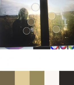
For this task we had a broad brief so I decided to combine the elements of the previous two tasks to produce an on location character introduction. In this piece I think I made good use of natural lighting, use of colour and demonstrated some good composition skills. I dressed my character in black in order for the environments colour to be the focus I think the warmer shots in the golden hour lighting look best as they compliment the warm tones of the forest however the cool tones of my characters hair also work well with the cooler blue tones of the grass and water in some of my shots. Colour often reflects the mood and tone of a piece ( The Verge, 2015) and I wanted the tone to be quite moody so I refrained from using brighter unnatural colours and used heavy contrast. I think the harshness of the environment helped to add to this also as you can see here on the pantone app I mainly used earthtones. An inspiration for my focus on colour was the twitter account @cinemapalletes which is pretty self explanatory but a good resource for looking at the use of colour in films and familiarising myself with the use of colour palettes.


I used my knowledge of the colour wheel to grade my piece enhancing the environments natural colours. However in some shots I dislike the lack of contrast and feel that this is something I should have adjusted further in the edit. I as well tried to implement some composition skills making the character isolated in each shot overwhelmed by the vast environment the opposite of my previous task where I shot my character incredibly close up to the point where the environment was ambiguous. I did this to make my character seem lonely and add to the moody tone.

I took some further visual inspiration from the series In the flesh (2013). Which is set in the countryside and uses a really naturalistic colour palette that gives it this moodiness and bleak tone. I like how the series uses their location to their advantage and colour grades to make everything look sickly almost with lots of greys and greens to emphasise the zombie theme. Interestingly in the flesh takes on the visual conventions of a kitchen sink drama and also the zombie genre which contrast really well as they use a realistic working class environment and community but employ the element of zombies.


‘ Art Directors are artists who can adapt their style to any number of different types of production. They integrate themselves and their team into the mood and feeling of a particular project’ Ackland-Snow and Laybourn (2017, P4). To conclude I have learnt throughout this module the importance of aesthetics within the production process and how they work together help tell stories and build worlds on screen through studying various approaches and practices of different film makers as well as experimentation on my part through the practical tasks. The artistic elements of film making are all about combining your film making and artistic knowledge in a way that helps to tell a story, convey a feeling or send a message. I have as well realised what improvement I need within my practical skills to better execute my production design and cinematography on future projects which mainly building my technical skill set.
References
Alex Mcdowell for Design Manchester. 2017. Alex McDowell Design Manchester. [ Internet Video]. Available from: https://www.youtube.com/watch?v=NsgJHrLFf5k [ Accessed on 29.12.2018].
It’s black Friday. 2016. My foundation routine with Grease Paint. [Internet video] . Available from: https://www.youtube.com/watch?v=x3CUOWwqwGI&t=36s [ Accessed 01.01.2019]
The Verge. 2015. How filmmakers manipulate our emotions using colour. [ internet video]. Available from: https://www.youtube.com/watch?v=0ZZgiSUyPDY [ Accessed on 05.01.2019].
Pitchfork.2016.A brief history of Goth. [Internet video]. Available from: https://www.youtube.com/watch?v=q1xd7dxBqOw/ [ Accessed on 01.01.2019]
Fox Searchlight. 2014. THE GRAND BUDAPEST HOTEL Featurette: “Creating a Hotel”. [ Internet Video]. Available from: https://www.youtube.com/watch?v=gYMfEKELveQ [ Accessed on 29.12.2018].
Film Riot. 2015. Mondays: No Budget Location Scouting & Not Being A One Man Band [ Internet Video]. Available from: https://www.youtube.com/watch?v=hPHGpOrNT_A [ Accessed on 29.12.2018].
Rose Lagacé (2013). PRODUCTION DESIGN PORN: Wes Anderson. Art Departmental.[Internet]. 31.01.2018. Available from: https://artdepartmental.com/2013/01/31/production-design-porn-wes-anderson/ [ Accessed on 29.12.2018]
Alex Mcdowell Interviewed by Susan Karlin (2013) Alex McDowell On Creating Krypton And The Future Of Production Design. Fast Company. [Internet] 07.11.13.Available from: https://www.fastcompany.com/1683341/alex-mcdowell-on-creating-krypton-and-the-future-of-production-design [ Accessed on 29.12.2018]
Robert Keeling (2017) The 25 most iconic movie entrances. Den Of Geek. [Internet] 25.04.2017. Available from: https://www.denofgeek.com/uk/movies/movie-entrances/48762/the-25-most-iconic-movie-entrances. [ Accessed on 29.12.2018]
Cinema Palettes. (2015). [ Twitter Account] Available from: https://twitter.com/cinemapalettes?lang=en. [ Accessed on 06.01.2019].
Neon Cinema. ( 2017). [ Twitter Account] Available from: https://twitter.com/NEONCINEMA. [ Accessed on 06.01.2019].
Gustavo Mercado (2013) The Filmmaker’s eye. Burlington MA, Focal Press.
Thomas M. Sipos (2014) Horror Film Aesthetics: Creating the Visual Language of Fear. North Carolina, Mcfarland and company .
Terry Ackland-Snow, Wendy Laybourn (2017) The Art of Illusion: Production Design for Film and Television. Wiltshire, The Crowood Press.
Dontnod Entertainment (2015) Life Is Strange. MultiPlatform. [Game]. Paris, Square Enix.
Seven. (1995). [ Film]. Directed by David Fincher. Los Angeles, CA Cecchi Gori Pictures.
I killed My Mother. (2009). [Film] Directed by Xavier Dolan. Canada, SODEC.
Suspiria. (1977). [Film] Directed by Dario Argento. Rome, Italy Seda Spettacoli.
The Grand Budapest Hotel. (2014) [Film] Directed by Wes Anderson. Germany, American Empirical Pictures.
In the Flesh.(2013)[TV series] UK, BBC 3, 17TH MARCH.