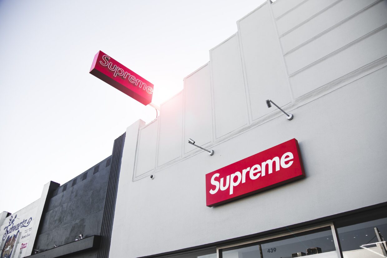
The evolution of the highly globalised and technologically advanced world is represented through the history of type development, whilst the core principles are filtered through each era the contrasting styles disclose the zeitgeist (Saltz, 2009; Tselentis, 2012). Supreme’s font is based on the sans serif typeface Futura only in a bold and italic style, derived from geometric forms enhanced by Paul Renner in 1927, to serve efficiency and legibility whilst being stylish (Bigman, 2012). Futura, marketed as the “font of our time” and the “font of the future” represents the evolution of Supreme and how the trickle-up theory has caused streetwear to be the future and the new luxury (Storozynsky, 2021). The timeless appeal and pleasing anatomy of Futura holds that modern aesthetic that Supreme also strive towards, therefore its fundamental values although different mirror each other (Storozynsky, 2021).
The primary colour red has a range of symbolic meanings, but connotations of love, passion, and intensity complement streetwear as a culture of individuality and diversity, which discloses Supremes’ choice for their logo (Dutfield and Wolchover, 2022). Barbara Kruger’s controversial and unprecedented style of artwork heavily influenced Supremes’ logo with the red and white boxed theme that has similarities to propaganda, allowing Supremes’ brand identity to have the same recognisable effect (Logo Poppin, 2021). The juxtaposing combination of the harsh red against the pure white with the bold font embodies the spirit of the rebellious yet inclusive consumers of Supreme (Rajendran, 2012).

Reference List
Bigman, A. (2012) Know Your Typeface: Futura’s Amazing Past. Available at: http://www.99designs.co.uk/supreme (Accessed: 6 April 2022).
Dutfield, S & Wolchover, N. (2022) ‘The Meaning of Colours: How 8 Colours Became Symbolic’, Live Science, 28 January. (Accessed: 6 April 2022).
Logo Poppin. (2021) How Supreme Logo Rose to be a Symbol of Chic Fashion Apparel. Available at: https://www.logopoppin.com (Accessed: 6 April 2022).
Rajendran, M. (2012) ‘The Development of Streetwear and the Role of New York City, London, and Supreme NY’, Theses and Dissertations, 924. (Accessed: 6 April 2022).
Saltz, I. (2009) ‘The Word’, in Saltz, I. Typography Essentials: 100 Design Principles for Working with Type. Beverly: Mass: Rockport Publications. (Accessed: 6 April 2022).
Storozynsky, T. (2021) Behind the Font: Why the Futura Typeface Never Looks Dated. Available at: http://www.extensis.com (Accessed: 6 April 2022).
Tselentis, J. (2012) ‘Typography Principles’, in Haley, A. Typography, Referenced – A Comprehensive Visual Guide to the Language, History and Practice of Typography. England: Rockport Publications. (Accessed: 6 April 2022).