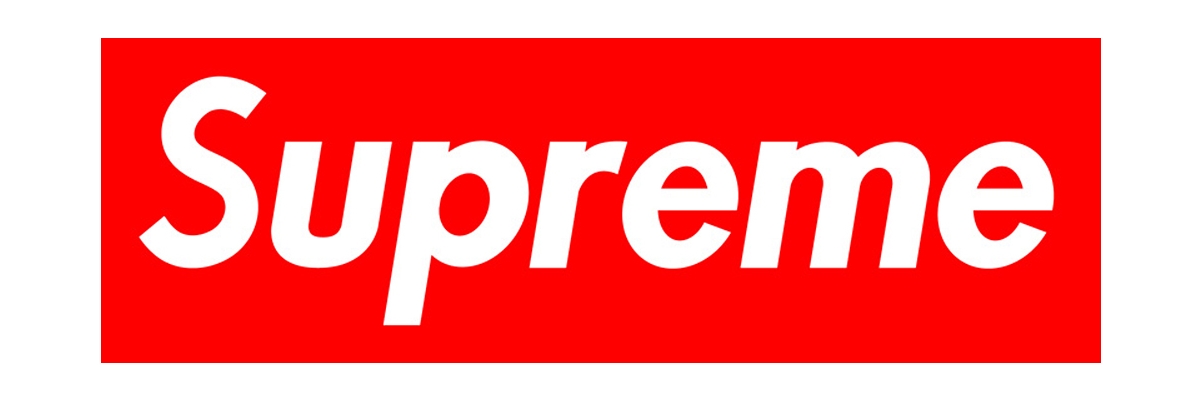
Supreme’s color and typography are well known globally, and Supreme’s visually impacted design is well organized. In designing typography, contrasts in size, shape, tone, placement, and color all matter how it looks (Tselentis, 2012). Supreme’s logo is made by making good use of those factors.
Firstly, it uses the San Serif font, which does not have small strokes at the end of the letters (HOJJATİ, 2014). This font gives people the impression of being modern, clean, and approachable. Hence, it fits well with supreme’s pop and street brand concept.
Secondly, the red box and white font are highly conspicuous. According to Salz, intense color creates pop, and the text in a bright color is a more prominent element in the hierarchy. Moreover, this design with the letters in the box is now an iconic design for supreme. The color of the box is not only red, but also black, purple, camouflage, and many other variations. The logo has value, so customers want to buy different logo variations.
Also, the size of the font is big enough in the box. It is essential to make a big size when designing typography. It is necessary to preserve legibility (Salz, 2009), but Supreme’s font is not too big, and some margins are left in the box to make it easier to read.
In conclusion, this simple and impressive logo is based on typography theories.
References
Hojjati, N. and Muniandy, B., 2014. ‘The Effects of Font Type and Spacing of Text for Online Readability and Performance’, Contemporary Educational Technology, 5(2).
Salz,I. (2009). ‘The Word’ in Salz, I. Typography Essentials. Beverly, Mass. : Rockport Publishers, pp58-105.
Tselentis, J. (2012). ‘Typographic Principles’, in Haley, A. Typography, Referenced. Beverly: Rockport Publishers, pp207-203.