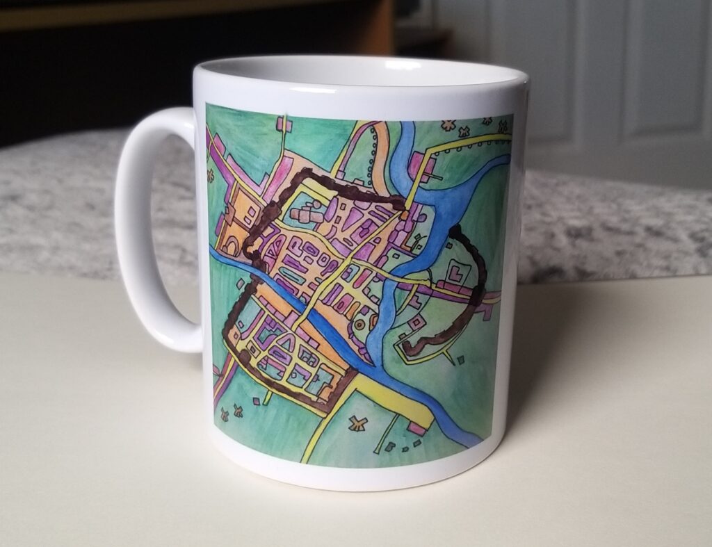
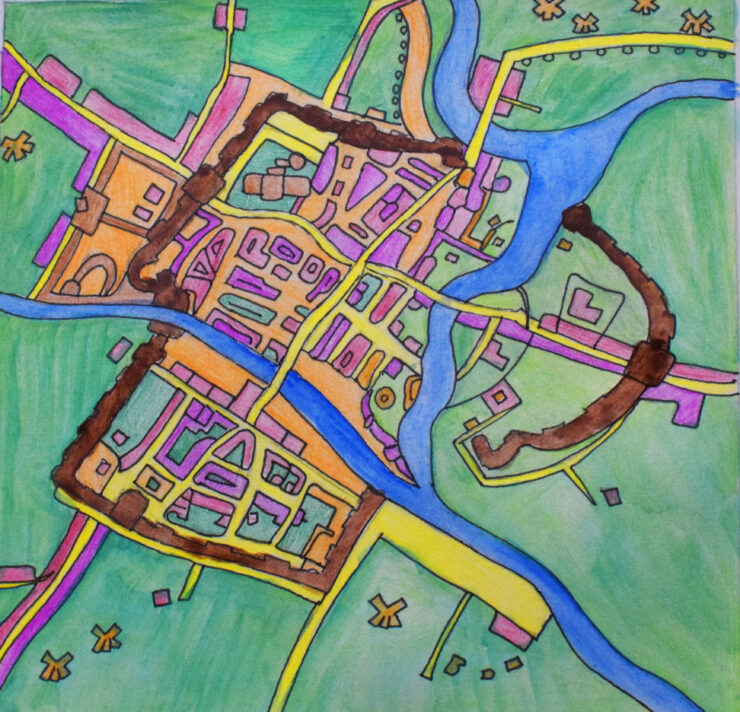
For this piece I chose to respond to Alicia Merrett’s “Yorke 1611” piece as I really liked her abstract version of York. In my version I initially just used pencils, but I later added watercolour as I liked to see all the different brush strokes on my piece. What I most like about my design is how easy the map is to read. When creating this design my focus was for the map to be as accurate as it could be to York in 1611. To do this I looked at actual maps of York in both 1611 and modern day and copied from them. The original version of the piece is extremely vibrant which is what drew me to this piece in the first place so when I added water colours, I didn’t think it stood out as much as I intended it to, so I later put my design on Photoshop and experimented with increasing the saturation and slightly changing the hue. I also decided to change some of the colours Alicia Merrett used in the original version as I didn’t want our work to be identical but seen more as a continuation of her work.

For this piece, my initial intention was to have it look completely different from the original. I experimented with having the piece fully in black and white and also by using completely different colours such as red, purple and pink both inside and outside the walls. However, I decided against using these for my final outcome as my main focus was to have the map be readable and these experiments were too unrecognisable. At first, I wanted the product for my design to be on a bag or a glasses case however after putting my design on different products digitally I thought the best outcome was by far the mug as I thought it was best suited for a map of York. I used fine liners in my piece as I wanted the piece to have its own visible sections where you can see the walls, rivers and even the minister. For the different buildings I used pencils to show the colours and I used watercolours for the fields and rivers as they were the larger areas of my design.
