Work Produced:
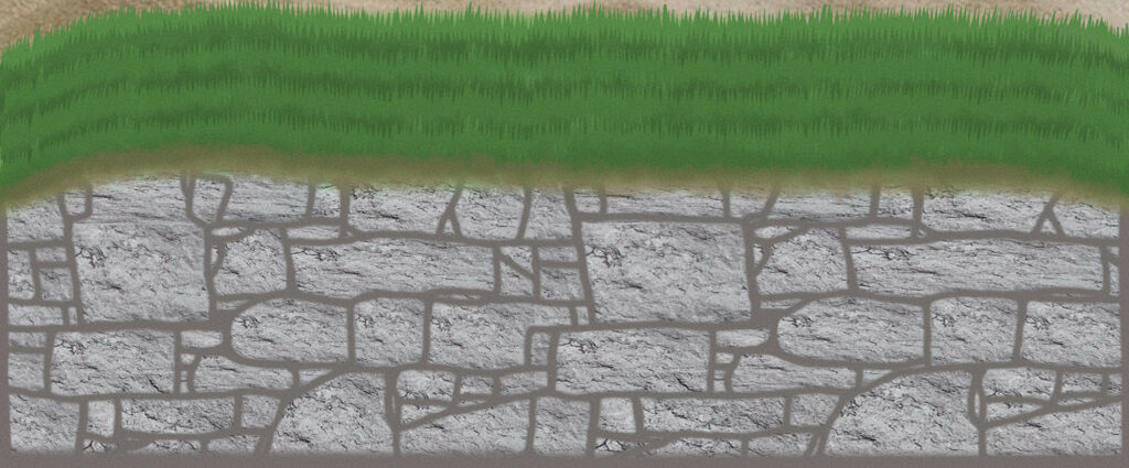
I decided to create an image based off of the quilt ‘Portlet Wall’ by Roberta le Poidevin, made in 2013. Although the original quilt was a physical piece of art, parts of it were created digitally, so I decided to work digitally for this project. The original quilt is meant to depict a wall, but since the work I decided to make an image for is a miniature quilt, I wanted to make it wider and more open, so I extended the wall in my image, making it longer. Roberta le Poidevin’s work was apparently inspired by a wall near the artist’s local beach, so I added some sand in the background. Alongside this, the original quilt shows a patch of grass at the bottom, however according to the artist the original wall that inspired the piece has a grassy bank above it leading to the beach. Because of this, in my image I moved the grass back to become a part of the more open image that wasn’t entirely focussed on the bricks of the wall. I also attempted almost a digital collage, with the bricks of the wall being made up of digital images of real stones.
Reflection:
I originally was planning on making a full digital collage, using the original image of the portlet wall as piece with many other pieces layered on top of the image. Eventually I decided that it didn’t look right, but I enjoyed making that connection to the digital means that the original quilt was created. I decided to just make a digital collage from images of stones and layer them on top of the stones in the wall to add a bit more realism to the image, since I planned to just digitally draw the other parts. I also had the idea to have an ocean peeking out from behind the wall, but I didn’t think the colours worked well with the mixture of browns and greens and yellows that made up the rest of the image so I removed it. I originally was going to leave the grass shown in the quilt at the bottom of the image to link to how the original piece of art looked, but in the end I thought it looked better with the grass just on the top because it draws the eye to the other things I put in the background.
