Lecture Content
During this lecture, we mostly looked at the skills required to pitch a story to an editor well. We were shown various rates of pay for freelancing work across UK publications as well, which left us all with some sense of hope that getting paid at some point is a possibility. Following this, we looked at being able to properly sub-edit pieces of work. As this is something that we will all be required to do to make sure that the magazine looks good and has content that represents the University well.
Design Element of the magazine
Progression:
Within the early part of the semester, it became clear that the general consensus was for a minimalist and professional look for the layout of the magazine was the most popular. The rules for this require there to be high quality and interesting images accompanied by white space and text.
For magazine design there are several “industry standards”, for example, the main body of text will all be size nine with a 13 point leading – or spacing between lines. This is the size of text that readers will see when they open the vast majority of publications. Working within these parameters and then ensuring that across the entire magazine the fonts are consistent with one another, for body text we are using Calibri and then we have more movement with headlines, which are at this point, down to personal choice. There is always some variation through a publication, but these a matched up with some of the consistencies that I have already discussed to create the feeling of the “House Style”.
Comparison and evaluation:
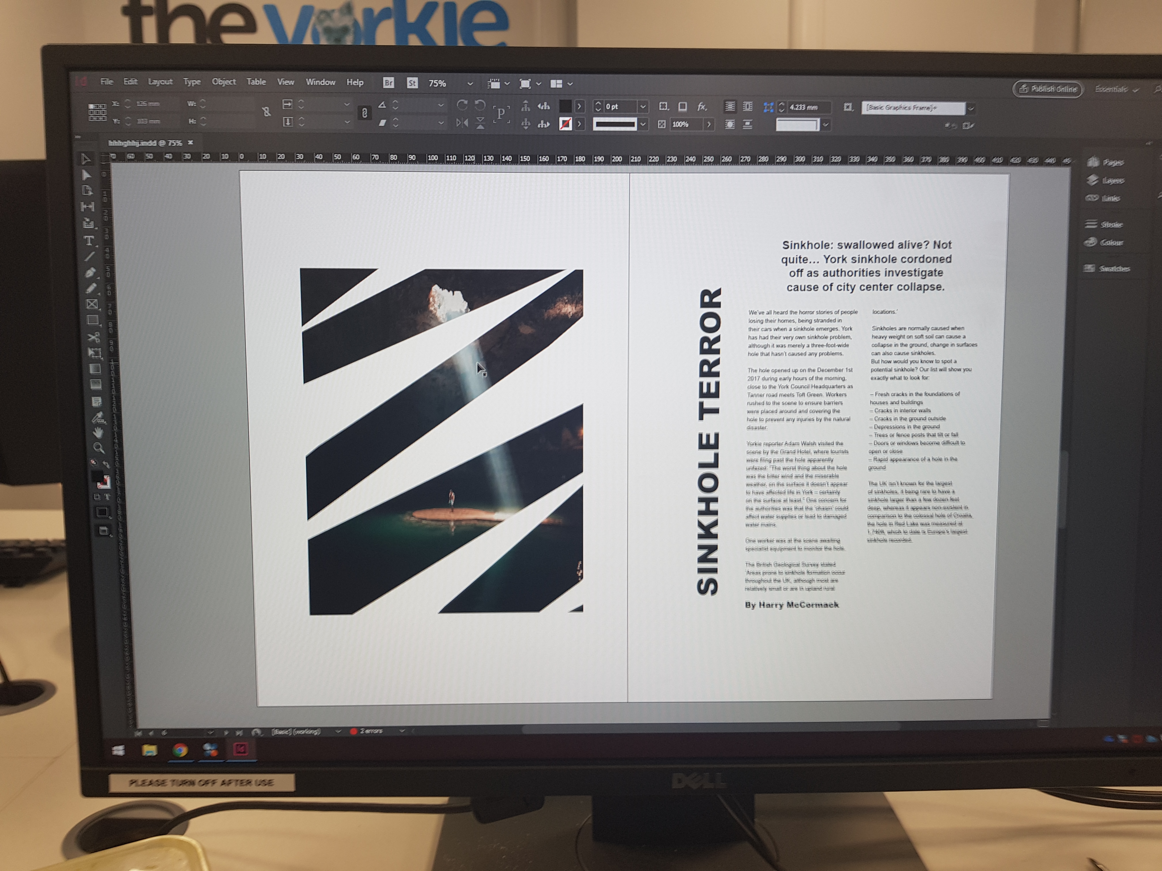
I concentrated on open white space and making the image an interesting part of the layout, not just a standalone element because I feel it is important to make the pages look interesting but also fairly spacious. This suits the type of magazine that the Yorkie is going to be; one that is filled with feature articles on a variety of topics. This layout would not work for magazines that concentrate on politics and current affairs, as you can see inside a copy of either The Economist or Private Eye, both of which focus on providing masses of text content and information for readers.
At this point, I am not sure whether I will stick with the design that you can see above, as I have no images yet for my feature and because it touches on some difficult areas like homelessness I am not sure whether this design would sit well with the content I am creating. When I have my images soon, I will have a clearer idea of how to progress further with this. To make this decision though I need to focus in on my idea and plan to get the best images possible for the feature, ideally, these would come from an event run by one of the organisations I have contacted.