Week 10/11 – Conclusion and final copy
During the past 11 weeks we have all worked well as a team and produced a highly professional publication which allows the reader to submerge in a variety of news and stories, sticking to the demographic throughout. I have learnt that magazine production is a long process which, from the beginning, every decision matters.
My role as a writer meant that I didn’t have a say in much of the production of the overall magazine, but this meant I had to produce a strong feature article which I believe I have achieved; it is a local story and celebrates the people within the city. ‘Homelessness on the rise’ is a constant problem therefore won’t be an outdated topic in months to come. My design and article has been produced from the knowledge and understanding of what I have learnt is successful in the magazine industry. By ensuring I work collaboratively and keep up communication with the rest of the team I was able to include the correct font, size of font and design. This has allowed us to have a key theme which runs throughout the whole publication.
I have learned a lot about design from this process and now have the confidence to use InDesign and make creative decisions from this. Throughout the process I have changed the design numerous of times to enable me to finish with the best outcome. By changing font, font size, layout of text and images multiple times it’s given me a final design which I am happy with.
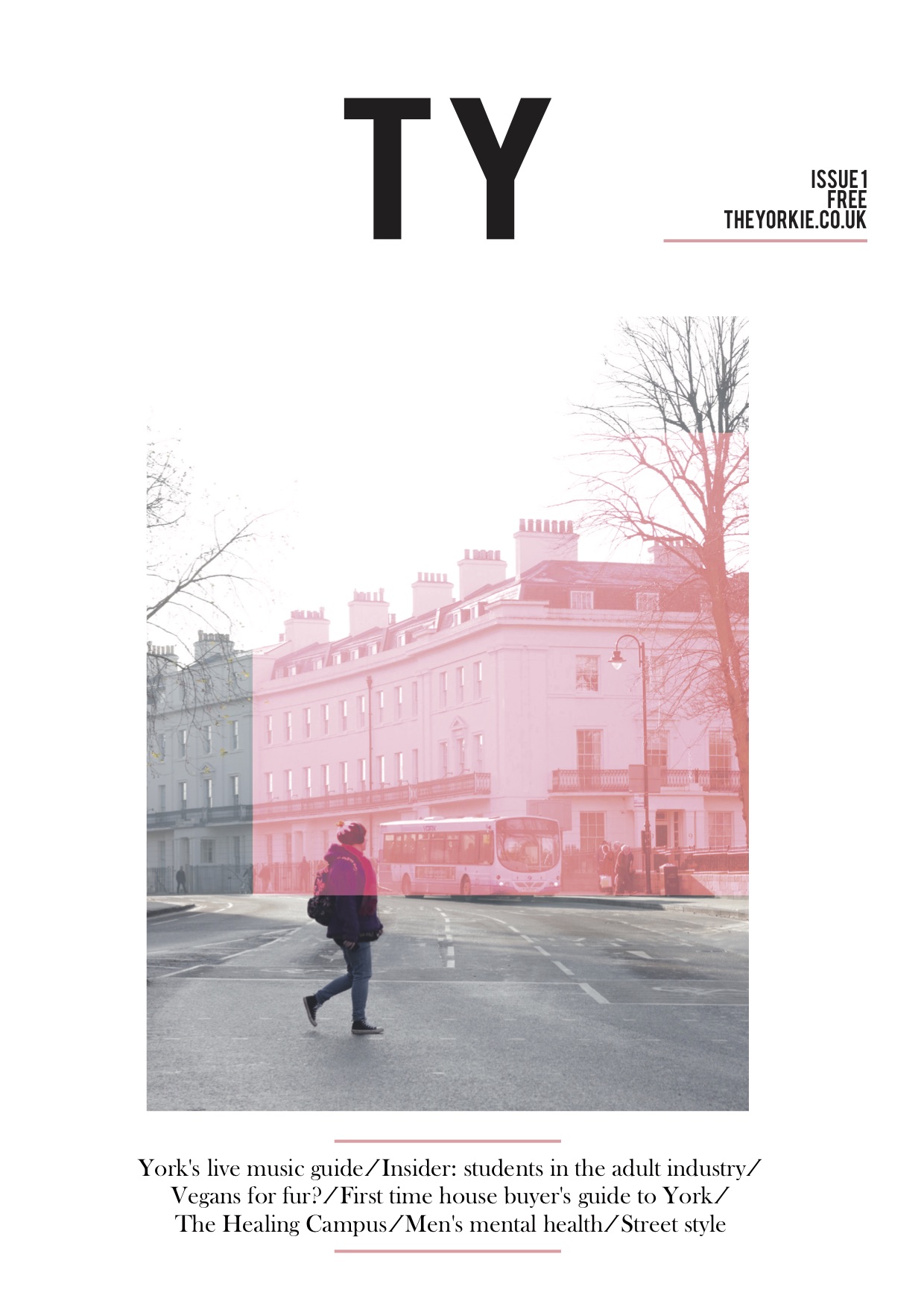
I have shared my opinion on what the front cover should be, this is an important aspect as it attracts any potential readers. I expressed that it should be modern with some colour but not too overpowering. From this, as a team we came up with a brand logo ‘TY’ abbreviating ‘The Yorkie’. I feel as though there is a gap in the market for a contemporary publication in York. Due to presenting our brand well on the cover and keeping it simple, it gives a modern outlook for the magazine. This suits our demographic of 18-30 because they will be more likely to find a modern design visually pleasing than an outdated one. The cover image keeps the locality of the publication and acts as a touch point for the readership. Furthermore, we went from an older man in the image to a young person walking across the street – this furthers the appeal to our target audience.
All in all, I feel that I have contributed proficiently to the process of The Yorkie. It has given me an insight into how the magazine industry unfolds and what the expectations of standards are. It’s allowed me to produce and design my own content, also, enabled me to learn from others and share ideas. Overall, this has worked effectively in the making of this publication. However, going on from this in future I have learned that I would like to take on a more proactive role rather than being a writer, this will allow me to have more control over the finished publication.
0 Comments