Week 9 – Design
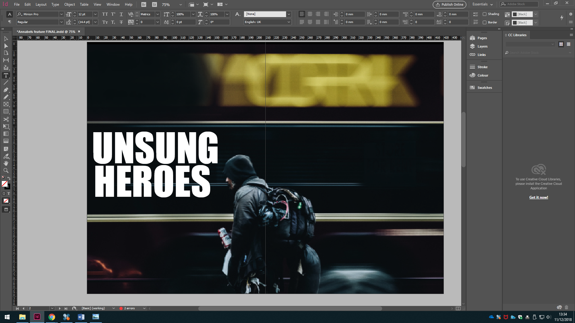
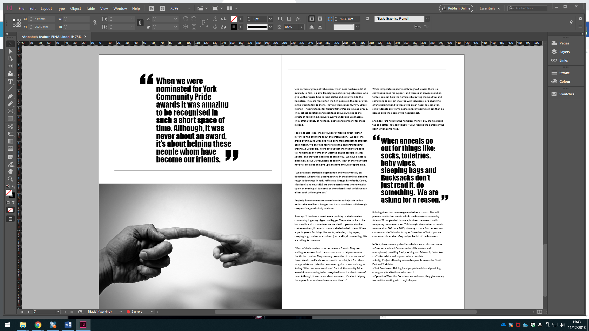
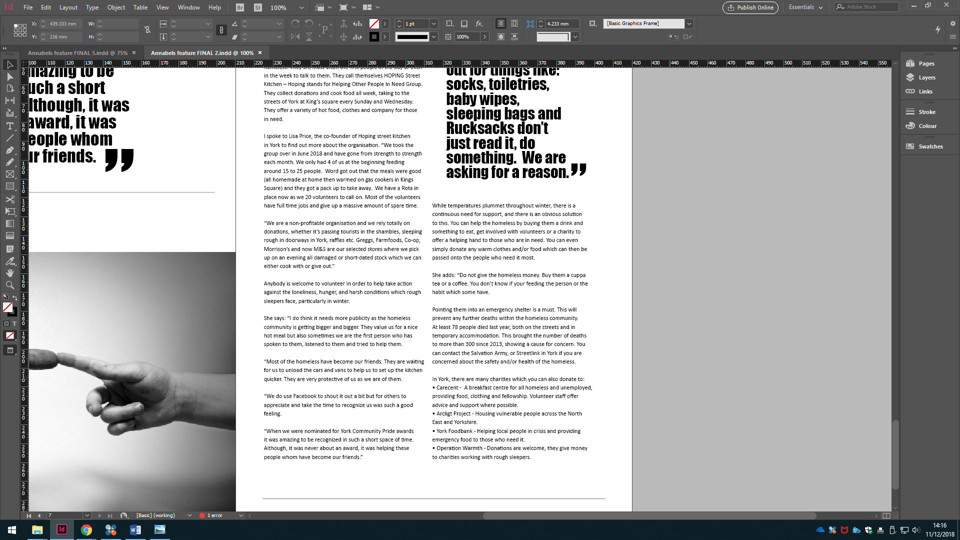
I finalised my pages on InDesign and created a layout that I am happy with. Due to the minimalist theme throughout I wanted to keep my idea simple. We were able to use a minimum of four pages or a maximum of eight, I used this to my advantage as I was able to make good use of the six pages I chose and spread my text over two of these pages as you can see below. Also, by using a double page spread at the start of my feature it allowed me to use my creativity to produce a prominent stance for my article. I put my copy of text into InDesign, including quotes, this gave me an idea of what other space I have to work with. Also, I was able to experiment with the pull quotes I chose and which placement looks best considering the reader’s eye.
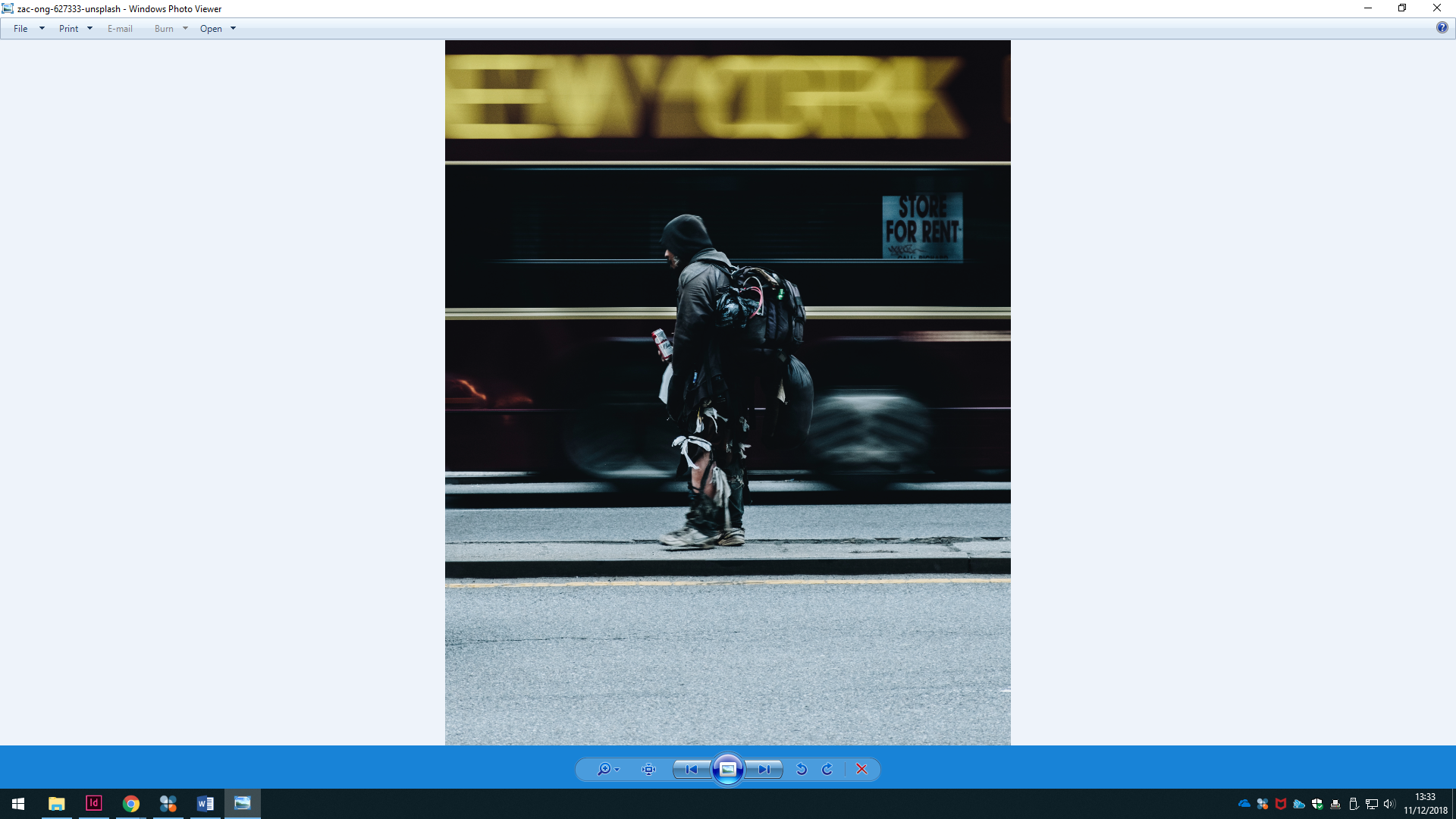
The images which I chose to use reflect homelessness which is a distressing topic so in order to juxtapose this I used an image which contemplates fellowship. I wanted to express the severity of the topic but not so much that it was off-putting for the reader; the article is also celebrating those that do their bit for people in need. The black and white theme I used ties in with the minimalist publication overall, but also emulates the serious side of my topic. I was able to retrieve the front cover photo for my feature from Unsplash a free image website. Although, it had printed along the top ‘New York’, I was able to correct this on InDesign to ‘York’ which gives it a less American and more local perception.
I have previously researched minimalistic magazine layouts and took inspiration from this for my own design.
“Minimalism is often about stripping away all the unnecessary things and focusing on the communication.
“Within minimalism, you tend you have a stronger say on exactly where your audience’s eye goes first, and one way you can achieve this is with scale. Have a look at the elements in this editorial spread from Saturdays Magazine, the eye immediately goes to the largest element: the pull quote on the right page, then the photograph, then the copy. A simple design, when purposely scaled, helps you dictate the exact path your audience will take over your publication.” (Mary Stribley)
From this, I have learned that minimalism can look good without being boring which is what my main concern was when finalising my design. The white space which I have worked around can be looked at as blank, however, this space is used purposefully left there to balance out my design rather than overcrowding it. I am now able to acknowledge the points where the readers eye is attracted to. This is why I have positioned my pull quotes and text where they are now.
I believe the copy, which I have included in my design, needed to be more concise in order to make the article visually pleasing and create a sense of space for the reader. This allows the page to look less intimidating and more inviting overall. In addition to this, I ensured that my content provided value and emotive language, along with informative facts and figures; this meant I avoided any unnecessary information which the reader may find tedious.
0 Comments