This week I have finalised my design for my feature.
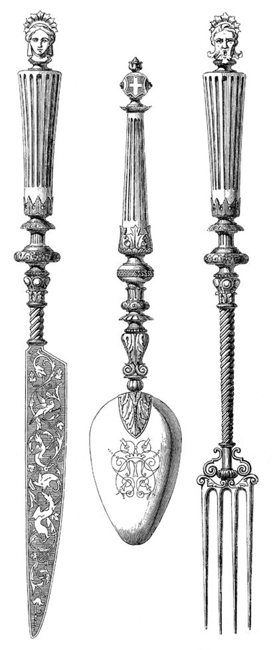
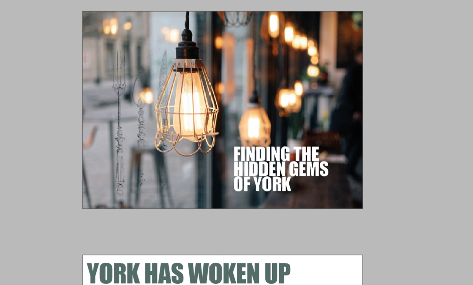
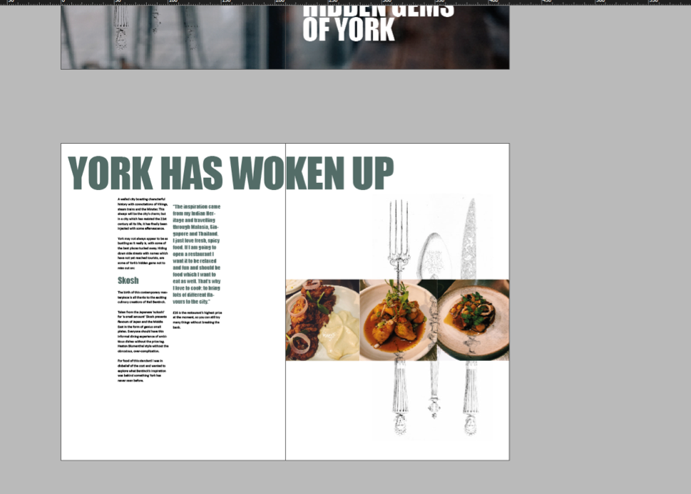
I experimented using a photograph from non-copyrighted google images of an old knife and fork, I used photoshop to edit the image down to be faded and placed this over the sequence of three food images on top of a white background.
This was the original:
The challenges faced were mainly to do with fitting words onto the eight pages we are allocated on InDesign in a creative way, then also having to reduce the word count to around 1100 words.
My design layout inspirations which I have included throughout the blog, did not work out perfectly in my final design due to the lack of confidence I have using InDesign and the images being taken by me of the food. With more practice I believe I would have used more whitespace and used the eight pages to appear more artistic and more in line with my vision.
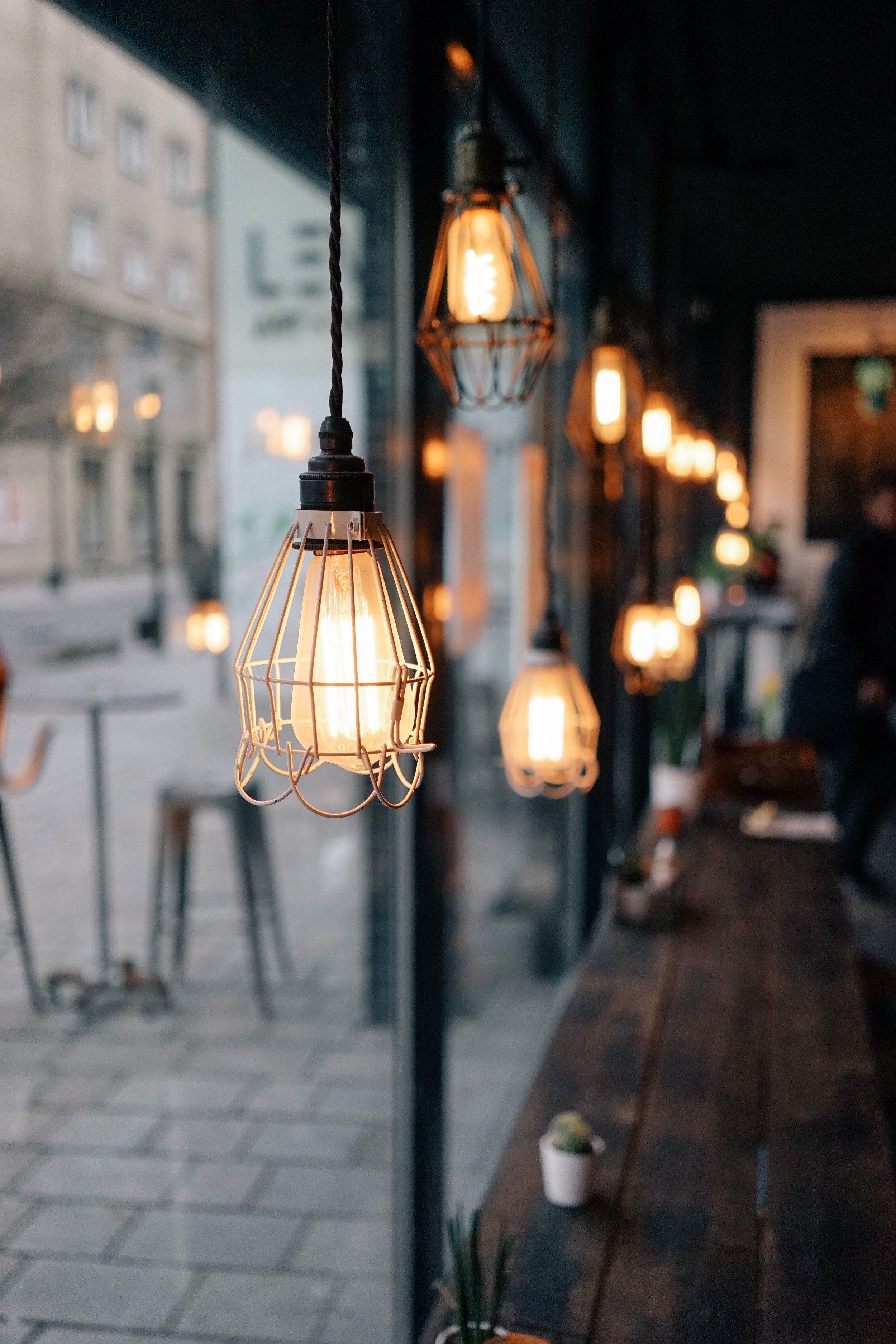
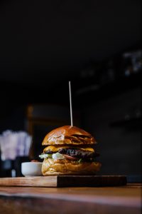
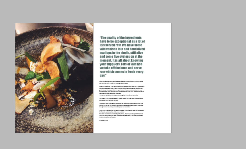
I gathered in-colour images from Unsplash and used these on the first and last pages as they are in higher definition, when I practiced with placing my images of the food in Skosh though, I found once I chose the quality of my images as High quality I could use one image I took on iPhone as a large one which worked well.
Here are the images I chose to use:
Our design brief states the requirement of being minimalistic, therefore I spread my work across all eight pages and made a conscious effort to make text easy to read and use pull quotes for important quotes.
I really like the use of my images and the range of sizes, I also feel the colours work well together. Once I felt I had proof read, tweaked my design and included everything, I then placed my finished feature into the folder provided by Molly, then I saved my images used into this folder.
I am quite happy with the overall design although I prefer to not use colour, I felt the olive green matched the overall layout best. It was enjoyable to create and I was passionate about the topic which I hope comes across in the piece, I managed to actually arrange a meal and eat with the chef of Skosh which made the piece a lot more in depth and passionate.
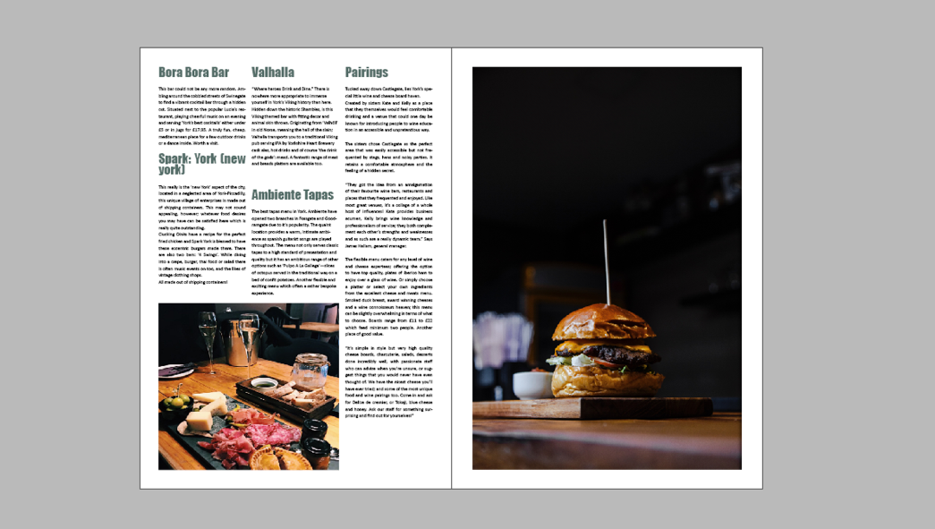
Unfortunately the other eateries did not get back to me, although I feel this worked out well as the quality of content I got from Skosh made it easier to include most of that and just focus mainly on Pairings and Skosh and mention briefly the others.
My design:
We had a few more decisions to make on the front cover of the magazine as this is a vital aspect of inviting readers and displaying in various ways what the magazine is about. So far some ideas have been to use a close up image of food, the minster, a street in York, a music gig, or a cat. I strongly advised we did not use a specific cat, gig or food as this may imply the magazine is themed on that specific niche. We laid out some options and Lucy had created an edited pink toned image of the Minster which had a white space and bold white initials as a logo for the Yorkie as ‘TY’. Immediately I noticed it and said it was in line with the design brief, it is creative, relevant and not misleading. Molly then focused on the contents page layout and we all decided her proposal of a geometric striking layout would work very well.
In choosing a font for the feature, I wanted pull quotes and headings to be in a different font to calibri. I used font theory from a psychological perspective on how we perceive fonts. According to this, light fonts (such as calibri) represent ‘beauty and femininity’ which I felt was appropriate for the aesthetic of my feature. Then for headings, a medium weight font of boldness was deemed most readable so I chose impact in green to create a soft but bold effect. The emotional response to font and associations our brain makes is examined by Kosh 2011, this helped in choosing a font which was not angular or too curly which may distract the reader from the written content and professional intentions of the feature.


