The importance of having a cohesive aesthetic in the magazine is something, as a group, we agreed to make a priority. After deciding to create a minimalist, artistic layout as a style; we have been attending weekly InDesign practice sessions to experiment. To achieve this look throughout the magazine requires leaving plenty of white space and focusing on ‘less is more.’ Bold text on plain background with a splash of colour on the other pages and columns of tidy text.
Due to my lack of confidence with technology, and in particular new software, I have not found this process easy. Regarding my strengths, I do believe I have a good eye for design but the use of new software does limit me.
Despite this, working within the borders and focusing on experimenting with simple processes on InDesign has been useful.
Font
I experimented a bold font in a large size to type the York postcode out (YO31) and use this as a background on one page, I practiced with photoshop blurring the logo created down to a translucent fade and layering this on top of an image of York from Unsplash. This worked well but the image was not relevant enough to my feature topic of food.
Image
Once I had my images, I practiced with how to incorporate them into the eight pages allocated. This proved harder than anticipated as there were so many from Skosh and not from elsewhere it highlighted the issue that this may confuse a reader on if the piece is about one place or many.
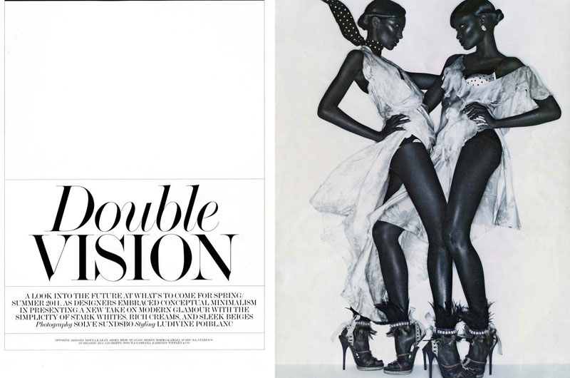
I then learned how covering a whole page with a strong image and placing main text on the other page can look very smart. I played around with this and added a pull quote in the middle like so:

I think it has been important as time has progressed, to acknowledge the themes and designs created so far by the others to ensure the aesthetic is perfect throughout. I saw what others were doing with their use of colours, and overall aesthetic and it was impressive to see how we had all created visually pleasing experimental layouts already at this stage. I then decided to do more research into what I liked in relation to the theme and this helped re focus me for the next InDesign session. Here are some layouts I like and would like to replicate in my own original way into the magazine:


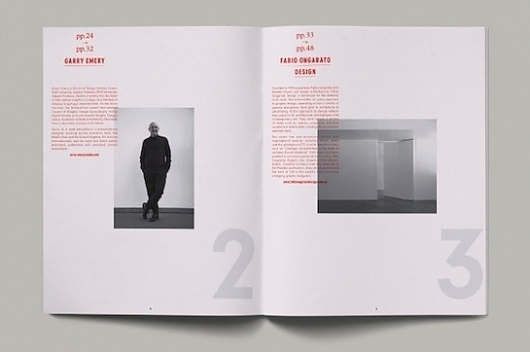


It is clear to see my tastes are in line with the magazine brief of ‘minimalist, black and white with a pop of colour’, which has been helpful. It is also essential to use the skills learned from InDesign to carry with us into the media industry as it is a vital component to add to our CV.
House Style
“The argument for consistency is very simple. Variation that has no purpose is distracting. By keeping a consistent style in matters of detail a publication encourages readers to concentrate on what its writers are saying.”
(Hicks and Holmes, 2002)
The overall read of a magazine should be consistent and easy. Text will all be size nine with 13 point spacing between lines. This is used in the vast majority of publications. Working within these parameters and using Calibri font allows experimentation with titles/headings.


