Week 7 – Design
This week we looked at design processes and what aesthetics we will be using. In the early weeks we decided, as a group, that the overall publication will have a modern and minimalist theme with a lot of images and text space. This came with the idea that it won’t be off-putting for the reader.
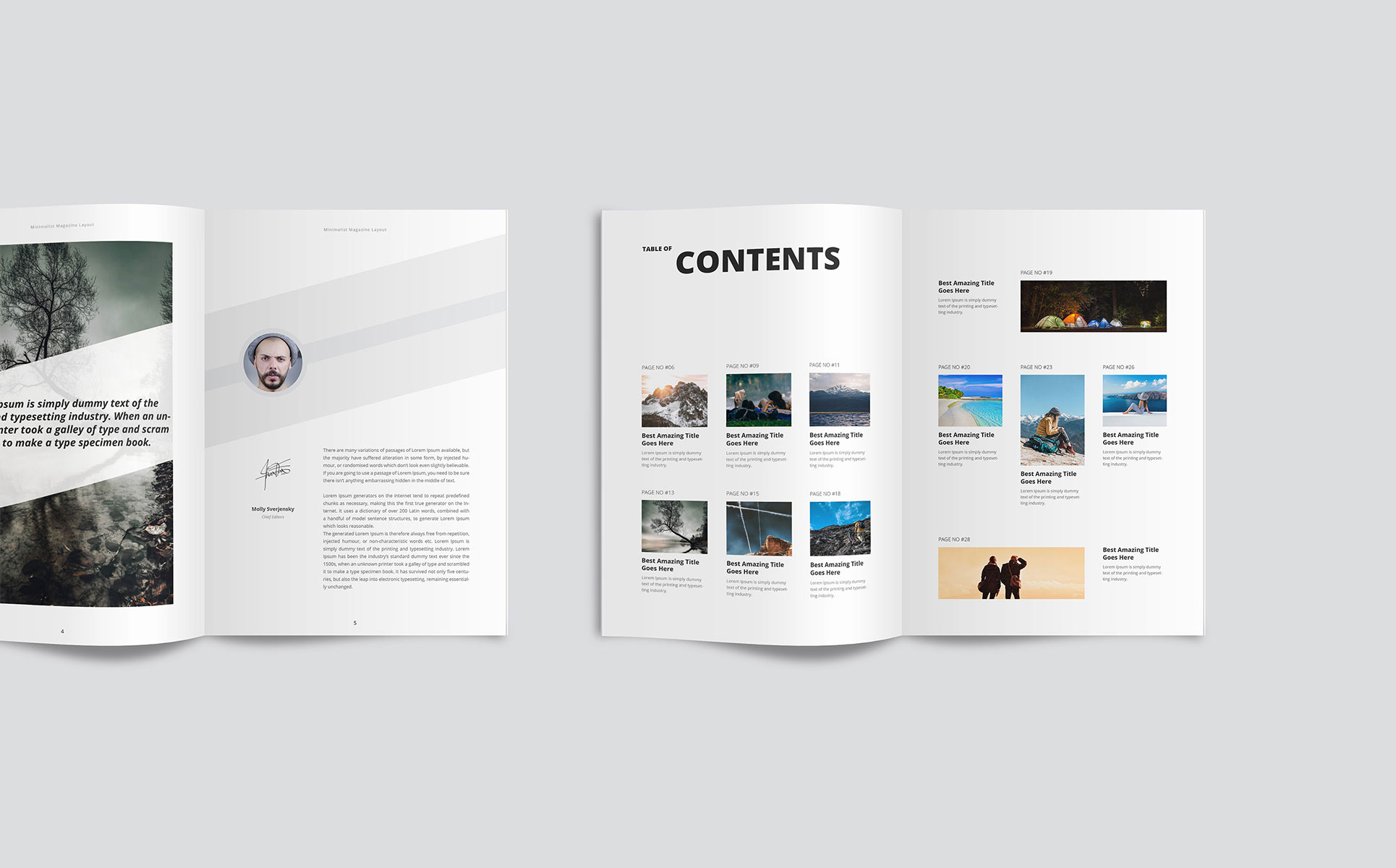
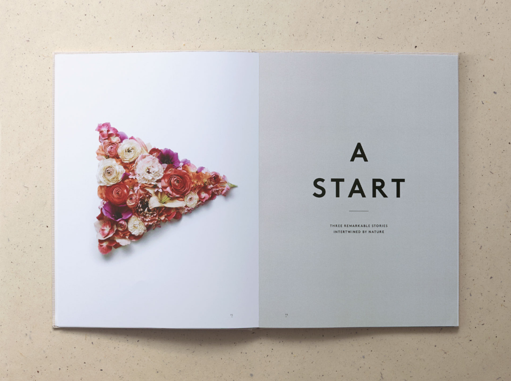
In order to kick start the experimenting with layouts, text and image, we have been having lessons on how to use inDesign. This is a creative platform in which we can visulalise how our feature will look. I was able to research various magazines to envision the layout which I found aesthetically pleasing – bearing in mind fonts, colours, use of space and placement of images. To ensure that the magazine has a standard look throughout, we set the font to size nine with a 13 point lead. Also, ensuring the main part of the text is set to the font ‘calibri’. These were the only guidelines set, therefore we can make it original by experimenting with the layout/image/colours/designs.
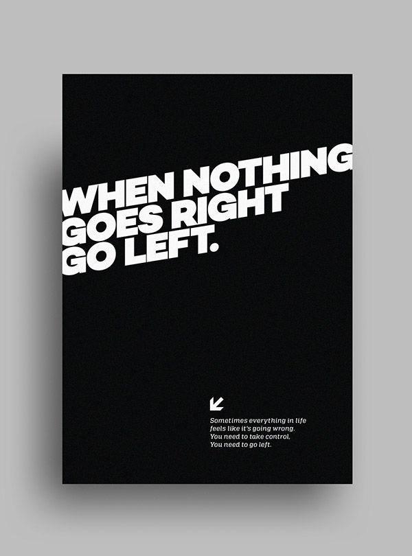
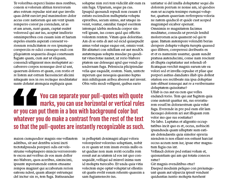
I find the use of space in these examples visually pleasing, with striking bold font complementing the design by drawing the reader’s eye onto the page. I also believe bold pull-quotes in a magazine work really well; this makes a prominent stance on the article overall and gives an insight into the article’s content. Considering the 1,000 word count, pull-quotes are able to break up long blocks of text and make it easier for the reader to consume. In order for them to work they have to be visually recognisable from the rest of the page, for example, different size, colour, font. “There’s no rule how long or big pull-quotes have to be.” From this, I will select a strong quote and chose which is the best part to put in, ensuring I have more than just a few words, but no more than two sentences.
0 Comments