During this week’s session we focused on elements of magazine production that will further develop our skills and help us throughout our life if this is the path we choose to take. For example, we were tasked with writing a ten-minute pitch about our feature that we would be able to present to editor. This looked at including key aspects of your feature such as what it is, why it should be published and why you should be the one to write it. In addition to this, we then dived in to how to properly sub edit work by going through a lengthy feature and picking out the mistakes. This task proved useful for me and the other desk editors as it allows us to sharpen up our senses when subbing writers works.
The design
When we first pitched our vision for The Yorkie, the result was a minimalistic style with the use of black and white and a ‘pop of colour’. To add to this, we also decided that the usage of photography would be essential to the magazine in which the images would coincide with the writing with in our feature articles.
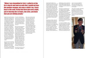
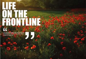
Therefore, when creating my design, I have followed our vision closely by collecting images that allow my feature come to life. Furthermore, I have used black text on a white canvas as this was another guideline we had set for the aesthetics. As my design is developing there are still quite a few changes I want to make, including filling in the blank white spaces on my spread. However, I feel that my current design is a good template to continue working on.
It is important to have your magazine aesthetically pleasing as it can deliver a purpose or a message to your audience through your images. It allows your audience to connect with your story on a deeper level, for example, if a feature is written about a person of interest, a photo of them that sits next to the text allows the audience to see whose story they’re listening to. The use of images also brings life and emotion to the story, “humans respond to what is attractive, beautiful, and desirable. Images make products and services tangible and give them an actual place in one’s life.” (Vanaye Hamilton 2014).
When looking at some of the rules of designing a magazine, it is crucial that a good kerning job is done. Kerning is the adjustment of space between characters with the font been a size nine and a 13-point spacing between lines. Despite focusing heavily on our aesthetics, it is important not to disregard the readability of the writing. This can be achieved by using a high contrast, using the correct font size and keeping the line lengths short. Finally, another rule that we should follow is using the correct alignment with our text and images so that they complement each other in a way that’s pleasing on the readers eye.


